There are two facets to growing your blog: (a) getting more traffic, and (b) keeping the traffic and making it convert well. Today, we’re going to talk about (b).
How do you fine tune a blog to keep more of the visitors who arrive? How to you make sure the message the site communicates “jives”?
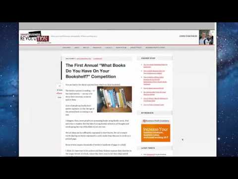
These are some of the questions I was looking into when I looked at John Corcoran’s site: Smart Business Revolution. John signed up for a public blog critique with me. I issued a private report for John, but now we’ll dive into John’s site here on the blog.
First, A Video Review
Now, let’s outline my findings…
Design Matters
The design of your blog matters. And it isn’t really just about being pretty. The main purpose of the design is to:
- Convey the “mood” of your brand.
- Draw user attention to the right things.
For this reason, it is often necessary to customize any theme you set up. Any theme you buy is going to be generic because it has to appeal to a mass audience. YOUR blog needs to appeal to YOUR audience, but it needs to also direct people’s attention. Since all blogs have unique audiences and unique needs, customization is often needed.
In looking at John’s site , he is using a fairly default installation of the Generate theme for the Genesis framework. It is a nice theme that features a nice, big opt-in form on the homepage. But, a few things should be changed:
- Unnecessary Stuff – John’s homepage is listing out the latest posts, and showing the category and tags for each. Most people don’t navigate using categories or tags, and if they did it would likely be from the post itself. So, let’s reduce screen clutter and remove that stuff from the homepage. Remember, the purpose of the homepage. Generally, the homepage is about message and then lead capture (aka list opt-in). In some cases, direct into money-making stuff. But, clicking into categories or tags from the homepage is a very low priority.
- Two-Column Post Listing – A lot of themes are designed to list latest posts in two columns, and John’s does the same as one scrolls down. It is too bunched up. My recommendation is to stick with a single column.
- Footer Contents – John is showing a dropdown of monthly archives (nobody navigates this way) and a big legal disclaimer (which shouldn’t be there). No doubt these are widgets. But, let’s instead focus on the FLOW of the user’s attention into the footer. The user will either be scrolling down there after scanning things above or after reading a post. In other words, a reader is slightly better pre-qualified once they reach your footer. So, let’s take advantage of that by placing an opt-in and some relevant “next step” links in the footer.
- Congruent Header Navigation – One of the things you never want to do is lead people into disconnected messages or dead-ends via your header navigation. John had a “New Here?” link in the header (now removed) which didn’t really contain anything useful. He had a link to a privacy policy in the header which was unnecessary (that belongs in the footer). And, he still has a link to his “Business Profit Academy” up there which leads to a separate site. My recommendation is to integrate the Academy into his main site to keep the brand congruent.
Making Your Message Clear
Much of my advice to John had to do with brand focus and communicating the right message for the target audience.
John is a lawyer and one of his goals is to refer more clients into his law practice via this site. In the long term, he wants to build up a new revenue stream which is independent of his law practice.
The target audience of this site is, according to John, small business owners who want to grow their business. Two things stood out to me here:
- There were some areas of vagueness in the message. It meant something to John but not to a new visitor. For example, the opt-in form title used to read “Join The Revolution”. It jives with the title of the site, but it means nothing. What revolution? What’s in this for me?
- There seems to be some confusion between the legal aim of the site and the small business side of the site. If the aim is to attract potential legal clients, then the content and brand message has to be different than a site about helping small business owners. That is, UNLESS the focus is on helping small biz owners with their legal concerns. However, judging from some of the content and the sales page of the Academy, law is not the focus here at all.
First off, if attract law clients is an aim here, there needs to be lead capture information clear as day on the site. Phone number, email, and an invitation to contact for certain things. This simple act would probably multiply the incoming business to John’s practice.
BUT…
More importantly, I believe John needs to decide once and for all what the purpose of this site is. Is it law? Or is it small businesses making more money? Perhaps there is a niche which combines both, but it needs to be made more clear.
From the perspective of blog marketing and content marketing (which is the focus of MY site), it would be hard to market John’s business via content marketing because the content being produced doesn’t line up with the stated intention. The message is a bit schizophrenic and that’s because there’s a mix here between how John is currently making his living (law) and what he WANTS to be doing (showing business owners how to expand).
Email Marketing
John’s list isn’t growing very quickly and he tells me he only emails it once or twice per month. So, here’s what needs to happen:
- I recommend taking some of the content from the Academy and repurposing it into a video series modeled after the 30 Day Challenge here on my site. You can also use each free video as an upsell opportunity into the full Academy. And this gives you a solid opt-in offer without having to write something from scratch. Plus, videos are better than ebooks.
- The clear opt-in offer needs to be placed in all opt-in forms (as well as the missing opt-in which isn’t in your sidebar – yet).
- Write up an autoresponder sequence and set it up to send at LEAST once per week to all subscribers. Use it to highlight some of your best blog posts, at the very least. If you don’t have the time to send emails to your list more than once or twice monthly, then use the autoresponder to do it for you. It is important to keep up regular contact.
Wrapping It Up
If you’d like to check out John’s site and see it for yourself, head on over to Smart Business Revolution. Do you agree with my assessments?
One thing I admire is that John is taking action. Not only was he willing to invest a little bit of money into perfecting his blog (buy way of having me critique it like this), but he also acted quickly on several of my suggestions. Already, just in the few days between my actual critique and me writing this post, I see that John has implemented several quick changes. So, that’s awesome and that’s how you get results!
And lastly…
If you’d like to sign up to have me critique YOUR site (whether publicly like this or in private), you can learn more about it here: Expert Blog Analysis.
Got A Question? Need Some Assistance?
Have a question about this article? Need some help with this topic (or anything else)? Send it in and I’ll get back to you personally. If you’re OK with it, I might even use it as the basis of future content so I can make this site most useful.