Mobile traffic is a really big deal these days. So many people are browsing our sites on mobile devices so it is VERY important that your site is mobile responsive to work on smaller screens.
When I look at my own stats as of this writing, about 38% of my traffic over the last 30 days was on a mobile device. And, almost all of that was on a phone of some kind – not a tablet. We’re talking small screens.
So, the question is… do your opt-in forms adjust properly and work well on such small screens?
Opt-in forms which may appear just fine on a desktop can be all but invisible or just plain annoying on a phone. For instance…
- A sidebar opt-in will usually be pushed way to the bottom of the screen on a mobile device, since sidebars usually just get kicked to the bottom. Your opt-in rate will be garbage.
- If you use an exit pop or some other popup, the trigger settings might not work right on mobile. Plus, there’s little that’s more annoying than having an opt-in completely takeover my iPhone screen when I’m on a site. It is interruption marketing at it’s finest.
So, you may want to change up your opt-in strategy for mobile devices. Display different forms that are more likely to work correctly on small screens.
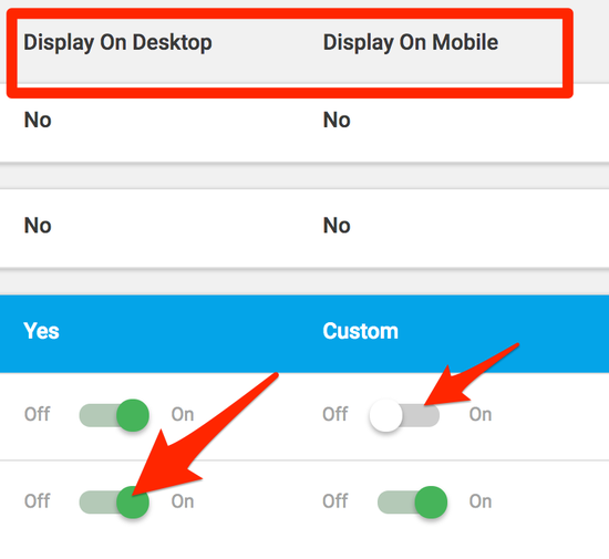
With Thrive Leads, you can easily do this by triggering the setting for whether to display on mobile or not.

For instance, you might have an exit pop that is set to show on desktop only, but for mobile you use a ribbon bar that is less obtrusive but will easily be seen on mobile screens.
Be sure to always test your blog posts and your site in general on mobile. You might be surprised what you find. You can test your site on mobile by:
- Using your own phone to test it out.
- Use Google Chrome or Firefox and the built-in Inspector tool to preview your site as various mobile devices. Just right-click and select “Inspect” to launch.
- Use an online tool like ScreenFly or MobileTest.
Me to test your site.
You may also ask…
Do people actually opt-in from a mobile device?
If the lead magnet being offered to them is compelling for them, yes they will. But, as we’ve said, that opt-in form needs to be EASY to use for them. If they have to re-size the form to make it accessible, or scroll way down to find it, they’ll be outta there.
This may be one reason why you might just want to have a less aggressive opt-in strategy for mobile. Their mindset is often in a different place when they’re sitting on their phone anyway. You’ll get more engagement on a desktop. So, what you may choose to do is disable your most aggressive forms on mobile. Stick just to the in-content opt-in forms and turn off the rest of it.
Plus, keep in mind that Google pays a lot of attention to mobile-friendly sites these days. So, if you have a big pop-up taking over the screen on a mobile phone, you might get dinged by Google.
So, your action item for today is…
Re-visit your opt-in forms with mobile traffic in mind. Are they easy to see and use? Should you disable them and create something specific to mobile screens that doesn’t screw up their user experience?
Don’t make the rookie mistake of assuming everybody is accessing your site the same way you do. 🙂
– David

Here’s how I help people every day…
Make everything about managing your site simpler… by having me on your team to help make sure everything goes smoothly. By providing the very best tools, the best hosting and maintaining everything for you… I’ll take care of the mechanics so you can just focus on growth.
Did you like this issue? Consider sharing the opt-in page on social media to help it grow.
And feel free to forward it on to somebody you think will benefit from it.
The WP Edge is the official weekly newsletter of the Blog Marketing Academy.


