OK, to end off the week of talking about various geeky matters of site speed, I want to talk to you about another typical source of slowdown on your homepage.
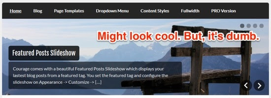
The slider.
A lot of people think they look cool. You’ll go to some homepage and there will be this big feature image. But, before you know it, it slides out and gets replaced with another one. Then, another one.
It is actually rather maddening. 🙂

And a lot of theme designers are enablers in this bad habit, too. Many themes have sliders built right in. The default theme has a nice stock photo in there and it makes the theme look good, so the blogger will use it, too.
But, we need to stop it. This is one of those classic cases where visual design conflicts badly with what actually works.
If you’re currently using a slider on your homepage, I recommend you get rid of it. And there are two reasons for that:
- A slider usually adds unnecessary bloat to the homepage and slows it down.
- A slider is actually quite terrible when it comes to effective online marketing.
Simply put, sliders harm conversion rates. They radically violate a basic rule of calls to action… which is to only give them ONE. Instead, you’re slipping a whole new thing in there every few seconds.
Sliders aren’t very user friendly, either. More often than not, the reader will be reading the headline or the excerpt and, before they can even finish or click the button, the thing slides out of view! Then, they either have to wait for it to reappear or use those stupid little arrows to try to bring it back.
So, whatever shows up in a slider usually has a much lesser chance of getting clicked on than anything not in the slider. It’s that simple.
Add to that the fact that they bloat up the page and slow things down – and there is just ZERO reason to have a slider on your homepage!
I think sliders are one of those things done by site owners because they think it makes them look cooler. They’re not really thinking about the end user.
Now, that big feature space at the top of a homepage where a slider usually goes… that is some valuable real estate! And, the look of the slider is usually just fine. In other words, the slider is based on a good idea. If it would only stop SLIDING! 🙂
Take a nice lead magnet and opt-in form and put it in place of that slider. Or, put in a nice branding image and headline there and don’t make it move.
Not only will your homepage load up faster, but it’ll convert better, too.
– David

Here’s how I help people every day…
Make everything about managing your site simpler… by having me on your team to help make sure everything goes smoothly. By providing the very best tools, the best hosting and maintaining everything for you… I’ll take care of the mechanics so you can just focus on growth.
Did you like this issue? Consider sharing the opt-in page on social media to help it grow.
And feel free to forward it on to somebody you think will benefit from it.
The WP Edge is the official weekly newsletter of the Blog Marketing Academy.


