How “Over-Delivering” On My Email Newsletter Secretly Tanked My Open Rate
I was surprised to find that my efforts to create a truly valuable weekly newsletter… was actually artificially HURTING my open rates. Here’s why…
So here’s a fun little business mystery I just solved. And like most of them, the answer turned out to be simpler… and dumber… than I expected.
For a while now, I’ve been pouring real effort into my weekly newsletter, The WP Edge. Not a lazy “here’s three links, see ya” email. A genuinely robust issue every week… two feature articles, a curated news section, behind-the-scenes stuff, the works.
And people liked it. I actually asked (in Issue #582). The feedback on the longer, meatier issues was good with rare exception. Folks told me they looked forward to it.
So you’d think the numbers would back that up. They didn’t. And that’s where this gets interesting.
If you create a newsletter from your email marketing tool, you need to know this.
My Newsletter Open Rate Wouldn’t Budge
For awhile there, my open rate for the newsletter would just be in this average range of around 30%. Not stellar, by any means. But, also not out of the ordinary for a newsletter. Sometimes it would drift into the mid-20’s and other times it’d pop up into the 40’s. And frankly, I can’t say I ever looked too deeply into the “why” on that.
But, then I decided to try to ensure I get more of my newsletters INTO the inbox. So, after years of sending the email out via Amazon SES as my email provider, I decided to bump up into Postmark. Postmark is about as good as it gets for deliverability. My emails land. That part isn’t in question.
See: Best SMTP Services for WordPress in 2026 — What Actually Works (And What to Avoid)
But… the open rates didn’t budge. In fact, worse than that… they were drifting downward.
When I first tried changing email services (to a new one called toSend), I literally got open rates less than 20%. When I sent to Postmark, the open rate went up, but we were still sitting in the low 20’s.
How the hell would I be seeing LESS engagement despite sending out via a top-shelf sender like Postmark?
That makes no sense on the surface. Better content, better delivery, happy readers, worse number. Pick one of those things to be wrong, because they can’t all be true at once.
At first, I thought this might be “new sender” noise. Perhaps I needed to “train” the internet about my new setup. But, I admit… this was a quickie conclusion and I didn’t dig too deeply into it. After all, I’ve got a lot going on and my clients keep me busy. 😇 I can’t spend too much time digging into my email stats.
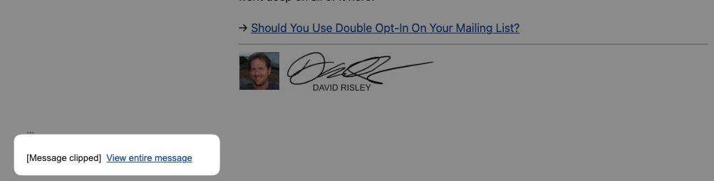
But, in the course of an ongoing business audit I’m doing “in house”… and an email from a long-time reader that mentioned this “clipping” issue… eventually the dots connected. And I was like…
Oh sh*t. 😳
The Culprit: Gmail Clips Your Message Off
OK, I didn’t know this. Perhaps I should have. Perhaps the fact that I didn’t know this is because I was stupidly “asleep at the switch”. 🫤 But, I eventually found out.
Gmail won’t display a message past a certain size. If your email’s HTML is bigger than about 102KB, Gmail chops it off and slaps a “[Message clipped] View entire message” link at the bottom. The reader has to click through to see the rest.
A couple of important details:
- It’s measured on the HTML only. Images don’t count (they load separately), and the plain-text version doesn’t count either. Just the raw HTML.
- 102KB is small. That’s not “war and peace.” A robust, image-light newsletter can blow past it without feeling long at all. I’ll explain why in a moment.
Now, before you go panic-measuring every email you’ve ever sent… this is mostly a newsletter problem.
Your typical marketing email… a welcome message, a step in a nurture sequence, a quick promo… almost never gets big enough to hit this. Those are short by their nature. It’s the newsletter that gets you, because a newsletter is the one email where you’re deliberately stuffing a lot of content into the message itself. Multiple articles, news, links, the works. That’s exactly the kind of email that balloons past 102KB without you realizing it. So if you send a meaty weekly like I do, this is the one to keep an eye on.
I’d vaguely heard of email clipping before. I figured it was a cosmetic annoyance… the reader clicks “view entire message,” mild inconvenience, no big deal. I thought when you had repeatable elements at the bottom of the email (like a call-to-action block) and it looked the same every time, Gmail would clip it just for the user’s convenience.
I was wrong about the “no big deal” part. Because of where the damage actually lands.
Why This Wrecks Your Open Rate Without Notice
Here’s the part that made me wince when I figured it out.
How does your email tool know an email was “opened”? It drops a tiny invisible tracking pixel into the message… a 1×1 image. When your email app loads that pixel, it pings the server, and that counts as an open.
And where does that pixel live? At the very bottom of the email.
You see where this is going. 🤪
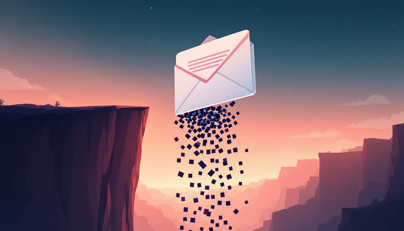
So my “low” open rate was never really an engagement problem. It was a measurement problem. A big chunk of my Gmail audience was opening the email, reading it, enjoying it… and registering as a non-open, because the pixel that proves they opened it got chopped off the bottom.
Read that back and the irony is almost perfect: my effort to over-deliver is exactly what broke the metric. The longer and more robust I made each issue, the more reliably I pushed myself over the 102KB line… and the more opens I quietly threw in the trash.
Better content. More valuable email. Worse number. Same cause.
How This Happens Invisibly…
Now, your first instinct when you hear “your email is too big” is to think I need to write less.
That’s mostly wrong, and this is the part I find genuinely interesting.
My own first instinct was to blame my tool. I use FluentCRM to send, and when I pulled up the actual HTML that gets emailed out… oof. It’s nasty. Bloated, repetitive, tables inside tables inside tables, the same styling instructions stamped onto hundreds of elements. Anybody who knows HTML would take one look and wince.
But here’s the thing… it’s not FluentCRM’s fault. You’d have this same problem using other email marketing tools as well.
Email clients are a mess. Outlook still renders email with an engine left over from the Microsoft Word era. Gmail, Apple Mail, Yahoo, and a hundred others all support different slices of HTML and CSS, and none of them behave like a real web browser. So to make an email actually look the way you designed it across all of them, you’re basically forced to build it out of nested tables with the styling jammed inline onto every single element. It’s ugly as sin. It is also the only thing that reliably works. Every serious email tool spits out HTML like this, because the alternative is an email that looks broken in half your readers’ inboxes.
So when I measured one of my issues, the email was around 140KB of HTML… but the actual words, the stuff people read, were only about 22KB of it. The other ~118KB was structure. A simple paragraph becomes a small mountain of code. Six little “in case you missed it” links cost me over 6KB… for six links.
And you would literally never know this is a problem with most email editors. Most of them will never tell you the full output size of your email. The only reason I found out was because I sent myself a test email and then had Claude go in and analyze it for me.
What Do You Do About It?
If you send any kind of substantial newsletter, you need to check and see if the final output email is over 102KB. If it is, you’re gonna get clipped. To solve it, you need to simplify and/or shorten your email newsletter so as to get it below that threshold.
Here’s some specific things I would recommend:
Measure the real thing, not the editor. Send yourself a test, then look at the size of the actual HTML that goes out… not what you see in the builder, which hides most of this. If you’re north of ~100KB, you’re flirting with the clip line in Gmail.
Aim under ~100KB, not right at 102. You want a little buffer, partly so that tracking pixel lands comfortably above the cut instead of right on it.
Use fewer, bigger paragraphs. This one surprised me with how much it mattered. Every time you hit Enter for a new paragraph, the email builder wraps that paragraph in its own table with a full load of inline styling. Ten short, choppy paragraphs cost a lot more than three tighter ones that say the same thing. So consolidate.
Turn repeating elements into hand-coded HTML blocks. This is the big one. Your header, your footer, that standard call-to-action box you use every single issue… if you build those in the visual block editor (assuming you’re using a WordPress editor like Gutenberg), each one explodes into a pile of nested tables. Rebuild them once as a single custom HTML block… hand-coded by you, or by someone who knows email HTML… and you can cut their size by 70-80% with zero change to how they look. And because these repeat in every issue, you fix it one time and benefit forever.
Rip out structure that isn’t doing anything. While I was in there, I found columns in my header that weren’t accomplishing anything except adding tables, and a couple of doubled-up dividers. Gone. Free space, no visible difference. Stacked spacers, empty columns, and “design” elements you forgot were there are pure dead weight.
Cut the scaffolding before the substance. Put all of the above together and the order of operations is clear: tighten your template and your structure first, and only trim actual content as a last resort. The waste is almost always in the wrapper, not the words.
Don’t confuse deliverability with this. A great sending service like Postmark gets your email delivered. It does nothing about clipping, because clipping happens inside Gmail after delivery. Two completely separate problems. You can ace one and fail the other… which is exactly what I was doing.
Best Practices Moving Forward
That last section there was some of the things I did to correct an issue to shrink it to get it down toward the cutoff threshold of 102KB. But, with the kinds of email newsletters I’m in the habit of creating every week, I had to do some interesting things to make it happen. And I had to cut some things that I didn’t want to cut.
So, let me summarize into some best practices moving forward. These are things I’m going to have to re-visit in my own newsletter process and the template.
Keep A Simple Newsletter Template. I know it can be attractive to create a nice, snazzy newsletter template. But, it can work against you. My template isn’t exactly over-built by any means…. I was causing my own problem because my content was so damn long. But, simple templates work. The closer you can get your newsletter to “plain text and links”, the better.
Keep Your Email Newsletter Pithy. For somebody like me, this can be difficult. I like to communicate. I like to give value. Longer content is easy for me. That said, it obviously works against me. So, truth is, email is a very different medium than a blog, a video or a podcast.
We simply can’t deliver that KIND of depth via email and expect it to work the same way. We either need to intentionally keep things shorter… or we should publish our newsletters to the web and make the email version short enough to land and link them to the full issue on your website for the full enchilada.
Or lastly…
Maybe don’t use Gutenberg to edit your newsletter. Not all editors in email software are created equal. FluentCRM 3.0 moved to the block editor for emails and that’s a good thing, IMO. However, clearly the transition from blocks to email-ready HTML is quite… bloaty. But, let’s not forget that FluentCRM can also send raw HTML. Which means, we can easily create the email in an outside editor like Stripo or even use our down custom templating system. This would then output cleaner HTML which we just inject into the campaign to send.
That last option does take matters into your own hands and must be done responsibly so that you don’t end up with a newsletter that doesn’t render well. But, done right, would likely produce a much cleaner HTML newsletter.
I Didn’t Expect That…
It is ironic, really. My desire to over-deliver and truly create a newsletter worth opening and reading every week…. was quietly punching me in the ‘nads. 🤪
The funny thing is… this Gmail clipping issue is actually an attempt by Google to make emails more convenient for end users and to protect them. It isn’t like it is a BAD thing. But, not being aware of it was quietly hurting my open rates.
Imagine if I had been running a normal re-engagement campaign on automatic during this period. 😳 I would have been purging people from the list because of inactivity… when they might have been opening my emails the entire time! We already know that open rates are an unreliable metric for other reasons…. but this clipping issue is one we have full control over. Not knowing it could be causing you problems without even knowing it.
A tighter, leaner issue isn’t the lesser version. In my case, it’s the one that actually… you know… gets counted.
Anyway. I’ve since gotten my issues back under the line, and I’m watching what happens to the numbers. I’ll report back in a couple weeks with the actual before-and-after, because I’m genuinely curious how much of my “open rate” was real and how much was just pixels falling off a cliff.
If you run a newsletter, go check your size today. You might be having a better week than your dashboard thinks.

David Risley has been building on the web since 1998 and founded Blog Marketing Academy in 2008. After years helping bloggers and online entrepreneurs grow their businesses, he now runs Concierge — a done-for-you WordPress management service for membership sites and online businesses. He manages hosting infrastructure, handles the technical heavy lifting, and keeps client sites running at peak performance. Click to read his full origin story.