Thinking Outside The Box: Opt-in Form Placement
Sometimes it’s good to think outside the box and question some of the assumptions that we make. This especially goes in the world of blogging and online marketing. There are a lot of things out there that everybody does and the thing is… if everybody does it maybe you need to go a different direction….
 Sometimes it’s good to think outside the box and question some of the assumptions that we make. This especially goes in the world of blogging and online marketing.
There are a lot of things out there that everybody does and the thing is… if everybody does it maybe you need to go a different direction. In this particular case I’m talking about opt-in forms and where you actually place opt-in forms on your blog.
Now, there are typically several places on a blog where you’re going to see an opt-in form.
- Top of the sidebar. This is the most common by far but it doesn’t work very well. And I think it’s because people have become blind to that opt-in form. People just see it so often and they become rather dismissive of it and therefore, typically, while it is one of the better locations to place an opt-in form, it still doesn’t give that great an opt-in rate.
- Underneath the post. A lot of people don’t do this but it’s a great place to actually have an opt-in form so that right when they’re done reading the post, then you get an opt-in form. And so, that works out really well.
A lot of blogs don’t even have an opt-in form underneath their posts. They only do the top of the sidebar and, while that’s better than having no opt-in form at all, they’re probably finding that they’re not getting that many people on their email list.
And, if you have only an opt-in form at the top of the sidebar and you’re coupling that with not a whole lot of traffic to begin with, you’re probably going to be really discouraged by how few people actually sign up for your email list because the conversion percentages are just not in your favor.
Take the Person’s Mindset
So, how about we think outside the box here?
Instead of doing what everybody else does, we try something a little bit different. The first thing we need to do is take a person’s mindset into account when they’re on your site. Are they brand new, or are they a returning visitor? We can (and should) be more aggressive at getting the opt-in for people who are new, but not so much to somebody who has returned to the site many times.
The other thing you need to ask is what are they doing on the page? Are they there just poking around, looking for something to do next or are they there specifically to read a particular post?
Why they did arrive there? If they arrived on your homepage, it’s a very different type of visitor than somebody who’s going to arrive on a post directly. Chances are, you’re going to have a lot of people that will come into your blog directly and they went into your blog post probably from a Google search or something like that. When they do that, they’re there because they’re expecting to see that post. And you don’t want to do a whole lot of things to get on their way at that point because that’s why they arrived.
Now, if they’re on the homepage, it’s a different kind of visitor. They didn’t come there for any particular type of content in mind. They came there just to check you out. So, it’s a very different type of person.
What are the STOP Points? By “stop point” I basically mean the places on a page where the eyeballs come to rest. Our attention tends to flow in different ways across the page. We tend to start at the top left and we scan across the top and we will arrive on the post, we read the headline, we’ll scan the first paragraph or generally scan down the left side. If you do a little better research into the “F pattern”, it gets into the general eye path on the side where people tend to do an “F pattern”. But, you want to look at what the stop points are. That’s where the attention comes to rest. And, generally at those points is where the person is wondering what to do with themselves next. And those stop points tend to be real good places to put an opt-in form.
Things to try outside the box
So here’s a few examples of some things to try that might be a little outside the box.
- Bottom Of Sidebar. How about instead of having an opt-in form at the top of your sidebar, you actually put it at the bottom of your sidebar? And the first reaction would be like, “what the hell are you thinking?”, because there’s going to be a lot less likely to be noticed. But here’s what you do. Using a little bit of CSS, you can actually make it so that as you scroll, this opt-in form actually stays static. So the way that it works is – as the person goes down the post, and as they start looking at the comments, the opt-in form is going to stay there the entire time. So, even though it’s technically at the bottom of the side bar, it’s more likely to meet them at where their stop points are because as they’re scrolling down to get to the bottom of the article, there’s the opt-in form. As they go to the comments, there’s the opt-in form. As they get down to the point they actually post a comment, there’s the opt-in form. It’s going to be there the entire time. You can also check out a plug-in: Strx Magic Floating Sidebar Maker.
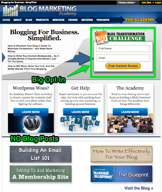
- A big squeeze homepage. On a typical blog, the homepage usually lists out the latest posts. That’s kind of what blogs do by default. Then how about we take into account the typical mindset of a person who’s there? They’re there for different reasons than some of you who come to a post directly. Why don’t we turn the homepage into a big squeeze page? By “squeeze page”, I mean that the primary purpose is to either divert them into a few choices or you get them on your email list. If you go to the homepage of Blog Marketing Academy, you’ll notice that I am not listing out any of my latest posts. That’s one of the few blogs out there that do it this way. The only content shown on that page are about 4 different resource pages, but other than that you pretty much just have the option to get on my email list or to click on 3 different features that lead into money makers for my business.

The current homepage of Blog Marketing Academy
- A “ninja” tactic. I have not implemented this but may give it a whirl at some point. It’s basically where you can get really, really aggressive on getting people onto your opt-in forms. With pop-ups and a big squeeze page looking thing that scrolls down from the header of your blog – even on every single post. A lot of people they would not put an opt-in form that big on every single post of the site because it’s just overkilling. It’s just going to annoy a lot of people. But here’s what you can do… you can still do those really big forms but then you “cookie” them. So that when they actually opt-in to the list, they’ll get a cookie on their machine and therefore, all the opt-in forms on the site can actually disappear at that point because you know that they’re on your email list already. Or, you could even have it so that maybe after a certain number of visits, then all those opt-in forms or maybe just the big opt-in form will disappear so that it’s not that as annoying for them. Instead, on the “Thank You” page, you can set another cookie that will actually make all the opt-in forms disappear. The idea here is, if somebody is on your email list already, they don’t need to have all these opt-in forms all over. So by having this “cookie” thing on your blog, you can get a lot more aggressive in terms of getting new opt-ins but the people who are already on your list are not going to see all that stuff.
So, these are just examples of thinking outside the box in terms of your opt-in form placement and increasing the opt-in funnel on your blog. I think you should look into putting some of them into use on your site.
I would love to know what you think about it. Feel free to post your comment on this blog post. I would love to hear what you think.
Reader Challenge:
In the comments below, try your hand at thinking outside the box with opt-in form placements. What ideas do you have to increase the opt-in rate?

David Risley has been building on the web since 1998 and founded Blog Marketing Academy in 2008. After years helping bloggers and online entrepreneurs grow their businesses, he now runs Concierge — a done-for-you WordPress management service for membership sites and online businesses. He manages hosting infrastructure, handles the technical heavy lifting, and keeps client sites running at peak performance. Click to read his full origin story.
Popular Right Now

What If Your Website Was Just… Handled?
I manage WordPress sites for creators and small teams who don’t want to fight tech anymore. Hosting, updates, security, performance — plus a real human you can ask anything.


