Core Web Vitals: The Dummies Guide To Increasing Your Scores And Satisfying The Google SEO Overlords
The Google Core Web Vitals are now important SEO ranking factors. So, what are they? How do you get your scores? And what do you need to do about it?

You’ve probably heard by now that the speed and performance of your site is pretty important.
It’s important not only for the user experience, but it really matters for your SEO rankings as well. Google takes the speed of your site pretty seriously.
In fact, it is only getting more stringent. Google has a set of metrics they call core web vitals and they are making algorithm changes that could end up negatively affecting your rankings if you don’t have passing scores on these numbers.
Thing is, tackling site speed can easily get really, really nerdy. And it can be quite overwhelming for people who don’t speak “geek”.
So, in this guide, I want to remove the fluff and just concentrate on the big picture stuff.
In fact, in light of the web vitals, I recently re-visited the site speed of this very site. Let me show you what I did.
What Are Core Web Vitals?

The idea of “faster the better” is nothing new. But, Google is now talking about these core web vitals and it has a lot of people talking about how to handle it.
In short, these core web vitals are core numbers that Google has decided are measures of a “delightful experience”. At this time, there are 3 core vitals. They are:
- Largest Contentful Paint (LCP). LCP measures how long it takes for the largest content element (e.g. a hero image or heading text) on your page to become visible within your visitors’ viewport. This is a direct measure of site and server speed.
- First Input Delay (FID). This is the number of milliseconds between when a user clicks the link to your page and when the page will be loaded and responsive to new user input.
- Cumulative Layout Shift (CLS). This measures visual stability. In other words, does the site shift and move after it is loaded up enough to make it hard to use.
There are obviously more numbers you can look at. But, essentially it all comes down to site speed as well a site which isn’t difficult to use. You want:
- The site to load up quickly in the browser
- The user to be able to interact with the site quickly
- Not have anything shift the site or get in the way, interfering with the user experience
These core web vitals each have numbers. And there’s a range you want those numbers to be in. They are:
- LCP should less than 2.5 seconds.
- FID should be less than 100 milliseconds.
- CLSs should be less than 0.1.
If you’re in the green, you’re good. Anything greater than that doesn’t necessarily mean you’re going to suddenly disappear from Google. 🙂 That said, they’re making no secret of the fact that these numbers will have an SEO impact, so it is good to pay attention.
OK great. So, now what?
How To Test Your Site
There are some free online tools you can use to do it. You can even do it right within your own web browser using the built-in developer tools. But, let’s keep this simple.
- Pagespeed Insights. This one is right out of Google.
- GTMetrix
You just plug in a URL, hit the button and let is spit out a report.
A couple important things to keep in mind:
- Each page of your site is tested as a standalone thing. So, your homepage is different than each blog post, etc.
- Almost every time you have the tool test the speed, you’re going to get a different number. For a variety of reasons. So, you want to run it at least 3 times and take an average.
Here’s a sample GTMetrix report for one of my blog posts:

You’ll see that the report lists the 3 core vitals right at the top. They use a stat called Total Blocking Time in place of the FID, but it measures pretty much the same thing.
If you’re using a Chrome-based browser, you can also run speed tests right at home. The built-in developer tools has LightHouse included.

To run it, do the following:
- Right-click anywhere on the page and choose “Inspect”.
- Developer Tools will popup. It will either be on the bottom (like my screenshot) or side-aligned. You can actually position Developer Tools wherever you prefer using the little gear icon on the right side and choosing an orientation. You can even put it in a separate window.
- One of the tab options will be LightHouse. Select that.
- Choose whether you want to test it as a mobile device or desktop.
- Click the button to run the report.
- Watch the screen gyrate and do it’s thing while it runs the test and then you’ll get your report.
This LightHouse report is almost the same as what you’ll get when you have one of the web-based speed testers do it since LightHouse is pretty popular.
I also definitely recommend checking out your site in Google Search Console. Really, the chief reason we care about these core web vitals is because of SEO, so this just makes sense. And when you get in there, you’ll see how important Google takes this because it is now a full section of the Search Console.
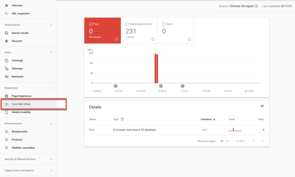
Search Console is also nice because it gives you a global view of how Google looks at your whole site. The other page tester only test one page at a time.
How To Improve The Core Web Vitals
No matter which tool you use, you’re going to get a bunch of data and recommendations. And unless you speak geek, it is likely to be confusing. 🙂
So, instead of going through all the possible things it could say, let’s just boil this down to simple, actionable things you can do to improve your scores.
#1 – Got Fast Hosting?
One of the simplest things you can do to help your site performance is to be using a solid web host that is capable of delivering your site to users – quickly.
Most average Wordpress users end up with a whole bunch of plug-ins installed – while simultaneously trying to use the cheapest host they can find. Now, there are definitely things you can do to get good performance out of cheap hosting, but you still need a good host.
The two companies I personally prefer are Siteground and Cloudways. I personally use Cloudways because you get dedicated server resources. More resources at the server level give Wordpress more breathing room and, hence, more speed.
RELATED: Cloudways Hosting Review: Is It The Best Host For Your Money?
#2 – Membership Site Separate?
This one only applies to you if you’re running a membership site.
Membership sites typically require more plumbing. More plug-ins. More dynamic elements. For this reason, membership sites usually run slower. This doesn’t matter, though, if it isn’t impacting your SEO.
I used to be a massive proponent of separating your membership site from your public site. Two separate Wordpress installations. And to be clear, in some occasions I still am.
Since I originally wrote that post, though, I merged my sites back together again. I had multiple reasons for that.
So, there MAY be a solid performance (and hence SEO) reason why you’d want to keep your membership site plumbing separate. It just needs to be balanced out with the bigger picture.
Certainly, running everything in one doesn’t necessarily have to mean poor core web vitals. There’s many things you can do to offset the potential technical drawbacks.
#3 – Run A Caching Plugin

Wordpress is a pretty dynamic thing. It takes a bit of server horsepower to chug all that stuff and spit out a webpage. Thing is, if you then save that output to a cache and then just spit the output at users without having to “re-chug”, it saves a lot of time. 🙂
That’s what caching is. It is a version of any page of your site that has already been processed. Instead of having to compute and query things all over again, your server can just spit out the HTML code. It’s a lot faster that way.
You definitely want caching enabled on your public content site.
Now, some Wordpress-specific web hosts have this built right in. On others, just use a plug-in to do it and you’re good to go.
There are tons of these things out there. Personally, I use Breeze. It is built by Cloudways and that happens to be who my host is. Very simple. W3 Total Cache is an extremely popular free option.
Much of the time, these caching plug-ins can do more than just cache. For instance, the Breeze plugin also does:
- Minification. Basically, it takes the code of your site and removes all the white space and useless characters, thereby saving download time. Can work well, but definitely something worth testing on a staging site first because sometimes it can break things.
- GZIP compression. It will automatically compress your site code before it is sent to the web browser, therefore making the site smaller and faster.
- Connect to a Content Delivery Network (CDN). A CDN is a performance-optimized server network that spits out static files – very quickly. By offloading images and certain site files that never change to a CDN, you can speed up load time because your web host doesn’t have to do all the work.
Various plug-ins offer different options. But, keep in mind, you don’t need a caching plug-in to do it all. Because there are other plug-ins that do far more (see below).
#4 – Run A Performance Optimization Plug-in
There are numerous plug-ins that are dedicated to speeding up your Wordpress site. They do a number of nerdy things to help improve those scores that come up in the speed reports.
The one I use and recommend is PerfMatters. This plug-in performs VERY well while itself being lightweight.
In the video above (on this post), I’ll show you the insides of PerfMatters. But, the thing works well. Whether you use PerfMatters or something else (like WP Rocket), you’re going to want to play with the settings to speed things up.
#5 – Minimize Use Of Plug-ins
I’ve been in some client sites (when doing the technical service work) and I’ve seen a lot of people running WAY more plug-ins than they need.
What usually happens is that they bought some cool plug-in and they install and activate it “just in case”. Then, even if they’re not even using it, it sits there and runs.
Every time a plug-in is active and running, it adds more code that your server has to process. It loads more resources. While the good (usually paid) plug-ins are usually coded with performance in mind, many (often the free ones) are coded sloppily and don’t respect the speed of your site.
Do not install and activate a plug-in on your site unless you’re really using it. Otherwise, de-activate it. Ideally, just delete it. If you ever need it, you can always re-install it.
#6 – Manage The Active Plug-ins
Now, if you’re anything like me, you will still end up with a decent list of active plug-ins. Plug-ins you don’t want to de-activate because you actually do use them.
But, there’s something you can do short of totally de-activating it. And that is…
Disable them when you don’t need them…. and activate them when you need them. On a page-by-page basis.
As I said, I personally use (and recommend) PerfMatters. PerfMatters has a really nice Script Manager built in that allows you to set rules to disable plugins, Wordpress components, theme elements, or CSS files…. and do it on a page by page basis.

If you choose to disable anything, you can choose where you want to do so. Most common would be to disable it everywhere, then go to the specific pages you want it turned on and set an exclusion.
I’ll give you an example…
Thrive Comments is a comment plug-in by Thrive Themes. I like it. Thing is, it does happen to output a bunch of code to the page. Technically, it will slow down the page some. If you’re not OK with that, then don’t use Thrive Comments. But, at the least…. why have Thrive Comments enabled on anything other than a blog post? So, you could use PerfMatters to disable Thrive Comments across your entire site… but only activate it on blog posts.
You can do the same for other plug-ins. Got a fancy forms plug-in on your site but you only need it on one page (like the contact page)? Well, disable it site-wide but only turn it on on your contact page. You can do the same with any plug-in that sits there even though it is only used in a few places on your site.
By doing this, it will avoid loading up any resources for that plug-in in places where the plug-in isn’t being used. This can really help speed up your site in some cases.
A plug-in called Plugin Organizer can do the same thing and it is free. I happen to think the PerfMatters Script Manager is simpler to use and has a much better interface.
#7 – Use An Image Optimizing Plug-in
It is important that any images you use on your site are optimized so they are not bigger than they need to be.
I’ve seen my share of people who post raw photos from their phone, for example. They are 1-2 megabyte files! Way too big! And it doesn’t occur to them to think about the file size.
First of all, before uploading images to your Media Library, you want to shrink the image file so it is using an optimized format and has been optimized for file size.

Then, use a plug-in that will optimize your images for you as you upload them. I have used Imagify and it works out very nicely. In fact, you might want to use it to clean and optimize your whole Wordpress Media Library.
RELATED: How To Clean A Bloated WordPress Media Library
More recently, I have switched over to ShortPixel. It optimizes images and all that, but another thing I like is that it will optimize the images to the actual site being used on your site. So, if you’re taking a 500px image and showing it at only 300px, ShortPixel can optimize and output the image back at 300px and save a lot of resources. It also will serve up the images from their CDN, thereby making everything even faster.
Also, don’t forget to use lazy loading on your images. This will make it so images don’t load up until they scroll into view on the person’s browser and this can significantly increase your LCP score. PerfMatters can do it and so can many others. In my case, ShortPixel takes care of it.
#8 – Remove Stuff From The Page
Let’s face it, sometimes all the optimization and CDNs and caching in the world just won’t get your scores where you need them to be.
Sometimes, the answer is simply to remove stuff.
Can you remove some third-party scripts from your site you don’t really need?
Remove large page elements? Frankly, even if you have to remove some images from a particular blog post to speed it up, it would probably be worth it.
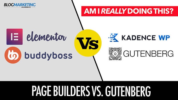
Do Page Builders Affect Your Site Speed Negatively?

When you’re using page builder plug-ins, it definitely adds overhead to your site. There’s no question about it.
I am a big fan and user of Thrive Architect. I also use Thrive Theme Builder. Any product like this which allows you to visually edit your site is going to introduce overhead. There will be extra code, extra CSS, extra javascript files.
And that goes for any page builder. Thrive Themes isn’t any exception. Whether it is Elementor, Divi, Beaver Builder or any other, it will have the same issue to a greater or lesser extent.
The question is… does it matter?
This is a classic question of benefits versus tradeoffs. For me and I imagine for most people, you get way more benefit by using a page builder versus trying to manually code such pages. It isn’t even comparable.
Also, by using the optimization strategies above, you can greatly minimize the impact of such tools. Truth is, basic site optimization strategies pretty much erase any negative speed impact of using page builders.
You can also consider simply sticking with the Wordpress block editor and skipping a page builder altogether. This will likely always be the best option in terms of speed since there’s no extra parts involved. Also, the block editor is improving constantly, so it is getting to a point where you can build decent pages with it. That said, I vastly prefer the speed and convenience of a purpose-built page editor like Thrive Architect or Elementor.
So, it is a matter of preference.
Yes, technically a page builder will affect your site speed. But, with some basic optimizations, the effect is minimal. And the benefits usually outweigh the hit. If you’re a purist about it, though, you can always stick to the default block editor.
Tips & Advice To Fix Common Issues
Besides the “big picture” stuff above, there’s some details to bear in mind that can be quite useful in fixing up issues and improving your vitals.
#1 – Use Fonts Smartly

Our page builders give us all kinds of flexibility when it comes to fonts. Especially hooked up to Google Fonts, you can almost do anything you want.
Thing is, every Google Font has to be loaded remotely. Those fancy fonts are not native to the web browser. And the more such fonts you are using, the browser has to pull down every one of them from Google. This means a slower site, more requests, and potentially a layout shift.
You’ve probably seen it before when a webpage first loads up it shows one front – and then a split second later the font suddenly shifts to something prettier. This is usually caused by a default font being used while things load up. Then, once the font and/or stylesheet is fully downloaded to override it, it re-writes the text in the new font. This shift, however, is a layout shift. It will hurt you in your CLS score.
So, it is recommended to:
- If possible, avoid using Google Fonts. It is super convenient, but avoiding it will help your site speed. If you absolutely must use a custom font, it would be preferable to load the TTF file directly from your server.
- Avoid using too many fonts at the same time. There’s really no big reason why you need a ton of fonts in use on the same page.
- If possible, use “web safe” fonts. These are the ones baked right into the browser and therefore require no additional overhead to use. And it will always look right across different browsers.
During my recent optimizations of this site, I switched pretty much all the text to Georgia. This is a “web safe” font. Before that, everything was running on the Lato font – and that was defined as my font in the Thrive Themes settings. It was pulling in from Google Fonts. Switching back to a web-safe font removed a little extra overhead. Plus, I think it is very readable so works fine.
When using a page builder, be careful about any fonts that your template might be pulling in by default. You can override the default font in your settings, but it is possible it’ll still be loading the default font in the background.
#2 – Set Widths & Heights
One of the biggest contributors to layout shift is not specifying widths and heights and instead letting the browser figure it out.
There are two main places this can come into play:
- Images.
- Page sections.
In short, you want images on-screen to have a width and height actually defined in the HTML. This should be done automatically for you in almost all cases. The only time this becomes an issue is typically when somebody customized an aspect of the theme and didn’t use properly formed HTML.
Also, let’s say you have a row on page that doesn’t have the height set properly. Inside that row is an image. What can happen is that the row appears on-screen at some minimum size…. and then quickly expands once the image loads up. That’s layout shift. An easy solution is simply to define your minimum height so that the row looks the same whether that image is loaded or not.
Again, I am now using ShortPixel to fix images to the proper sizes on the fly.
#3 – Avoid Intrusive Ads & Popups
Do you have ad spots on your site? Popup opt-ins? Header banners that come in and push the whole site down?
All of that presents massive layout shift. It is even more pronounced on mobile devices.
So, here’s some tips:
- For any ad spots you might have on your blog, define the width and height so that that spot will appear the correct size whether the ad is loaded up or not.
- If you’re going to use ads that appear over the site or in the header (pushing the site down), consider not using a delay. By having it appear instantly, it looks like part of the site. A delay will cause the whole layout to shift when it shows up.
- Consider exempting intrusive ads or opt-ins from mobile devices, since these smaller screens make the use of such things significantly more intrusive.
A Little Trick For Finding Sources Of Layout Shift
You will likely find that Cumulative Layout Shift (CLS) is the hardest metric to address. That’s simply because there’s very little in the way of guidance to show you exactly what’s causing it.
Most of us have pretty fast internet connections. So, when you refresh your page, it loads up really fast. So fast that you cannot tell where the layout shifts are occurring.
One thing you can do, though, is slow things down. Basically, load up your page as if your internet connection truly sucks.
This is built into Developer Tools. So, once again, head on over to your Chrome-based browser (I personally use Brave Browser) and open up those DevTools using “Inspect”.

- Click on the Network tab.
- You’ll see a little speed dropdown. Likely, it will be set to “No throttling”. You. may have other presets in there to simulate mobile speeds.
- In that dropdown, click “Add”. then “Add Custom Profile”.
- Name the profile whatever you like. Like, “Really Freakin’ Slow”. 😉
- Then set up low download speeds. Something like…. 100 kB/s.
- Save the profile then ensure it is selected as your throttling profile.
- Reload the page and watch what happens.
You will basically now simulate loading your webpage as if you have a really, really slow internet connection. But by doing this, you can watch the page appear gradually and see how the layout shift takes place.
Be sure to go back to “No Throttling” when you’re done so you can back to the 21st century and not dial-up speeds. 😉
On my site, I had CLS issues with Thrive Theme Builder that I never did resolve. But, they went away when I switched the whole site to BuddyBoss. So, sometimes, you have to get right to the heart of your theme to fix this one.
Let’s Wrap This Up
As you can see, the purpose of this post was not to go deep into nerdville. Truth is, you can get really far with website performance just by using the right tools and doing basic practices.
Once you go past that, though, that’s where it can feel like squeezing juice from a turnip. It is easy to get into a situation where you keep trying stuff, re-running the report and getting no change. Until you have no hair left. 😉
So, do what you can. Do the big stuff. 🙂
If you need some help diving deeper into nerdville, you can always look into using our technical services. Pick up some service credits and I’ll be happy to take a look.

Definitely don’t just ignore it, however. Clearly, Google really cares about this stuff. The core web vitals are now a fundamental ranking factor, like it or not. And unfortunately, we have to care what Google thinks. Bow to your overlords.
The use of core web vitals in SEO began in May 2021. It is now “law of the land”. It will probably evolve over time.
So, whether to appease our Google overlords or just to be a cool web citizen, you might as well give this one some of your attention. 🙂

David Risley has been building on the web since 1998 and founded Blog Marketing Academy in 2008. After years helping bloggers and online entrepreneurs grow their businesses, he now runs Concierge — a done-for-you WordPress management service for membership sites and online businesses. He manages hosting infrastructure, handles the technical heavy lifting, and keeps client sites running at peak performance. Click to read his full origin story.