Perfect About Page Formula: Create A Conversion-Focused About Page With This Template
Your blog about page is one of the most important pages of your site. This formula (w/ template) will guide you to creating a conversion-focused page.

When’s the last time you took a good, strategic look at your own about page?
Your about page is one of the most important core pages of your entire blog. Yet truth is, most people totally blow the opportunity.
It has been a while now so I don’t have the stats available anymore, but one time I ran some click-tracking tests on the top menu. What I found in that test was that “About” was the second-most clicked menu item in the top navigation, right after “Blog”.
Now, I can’t sit here and tell you that is universal. But, I think it is a pretty safe bet to say that your about page is quite an important core page of your site.
And there’s a good chance that it is high time that you take another look at your’s and make sure it is up to snuff.
So, on that note, let’s take a good look at how to make an about page that works and doesn’t bore people to death.
Your About Page Is A Sales Page
Typically, a sales page is thought of only as something which tries to convince the person to buy something. But, let’s think bigger.
Your about page might not be trying to sell something for money, but it is selling you. It is selling the reader on WHY they should care about you, your blog and your business.
Like any good sales page which is primed toward a conversion, we need to keep certain things in mind…
- It needs to convey a “hook” and message quickly that makes people want to actually read anything. And that’s because…
- Most people don’t sit there and read the page. They scan it. So, we need our about page to reach out and get the message across to scanners. All so that…
- We lead them into a call to action. Only instead of an “Add To Cart” button, we’re likely going to lead them into an opt-in form to become an email subscriber.
According to one post by Aweber, one company increased their subscriber growth by 158% by adding a lightbox opt-in form to their about page. Your about page is actually one of the top list building locations of your blog. It also happens to be one of the most visited pages for people who are newly arriving to your site for the first time.
So, it is worth spending a little extra time to make an about page which truly makes an impact.
We need to:
- Craft a page which communicates our value proposition to people who are too lazy to read the page.
- Entice them to become an email subscriber.
So, with that in mind, let’s talk about the structure of your about page…
A Basic About Page Template Layout
Is your blog’s design as conversion-focused as it could be? I’ve developed the Blog Design Audit to guide you through each of your core pages and design elements of your blog so you can evaluate whether they’re fully optimized for max effectiveness. Click here to grab your copy.
What most people do (most likely you, too) is simply create a standard page inside of Wordpress and write the text of your page. In other words, the about page looks just like any standard page of the site and it is a wall of text – perhaps with a photo or two.
BORING! And more importantly, rather useless.
I highly encourage you to treat your about page with the importance it deserves. Which means giving the page a conversion-optimized layout – not just the default text-only look that comes with most blog themes.
This is not the technical issue you may think it is. If you use a solid page builder such as Thrive Architect, you can take full control over the page layout without being trapped by your theme.
So, let’s start with an overall structure…

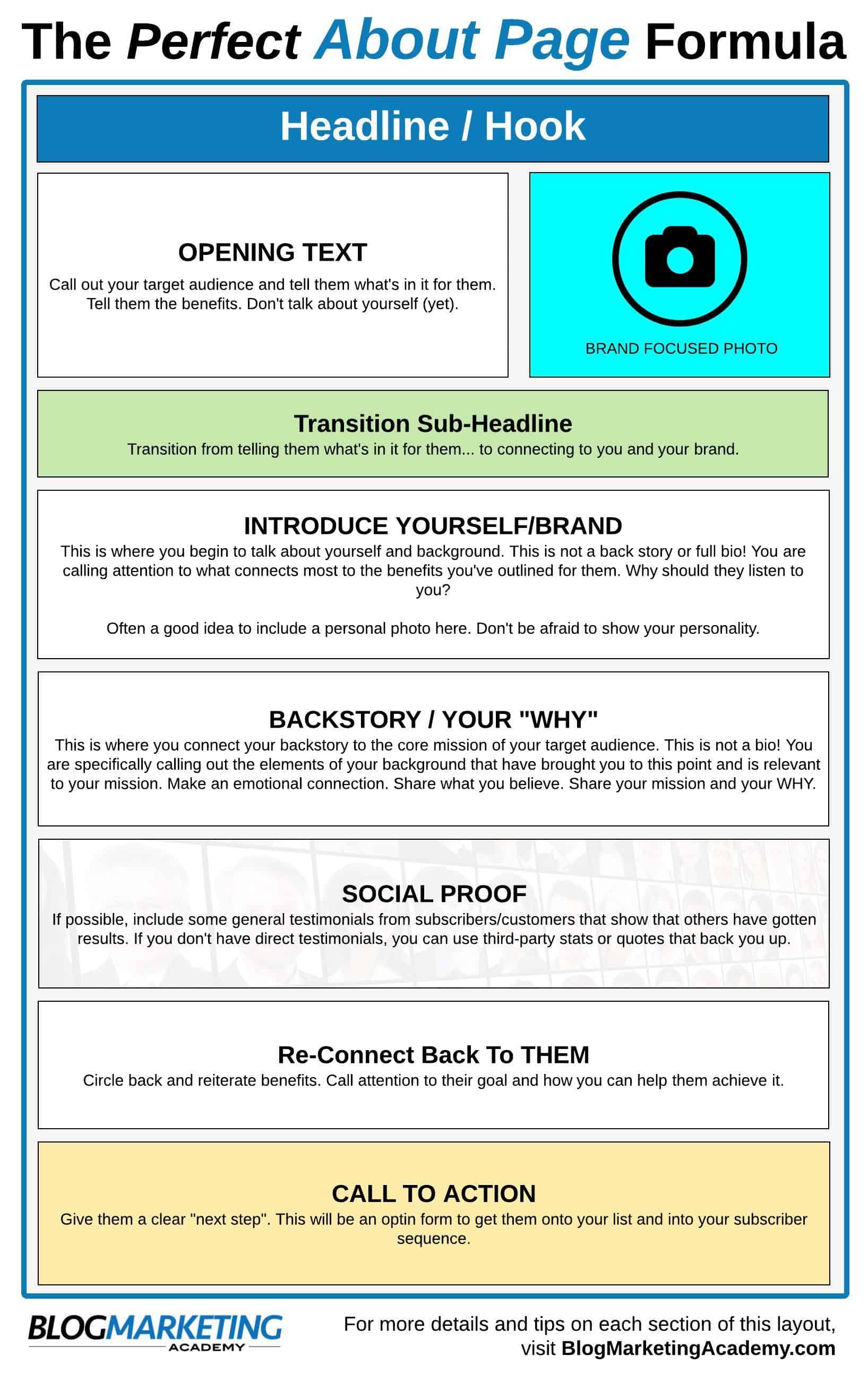
This template provides an overall layout of the flow and contents of your about page. Now, let’s go through each section here and discuss how to put this thing together…
Implementation Guide For This About Page Template
First, I want to make clear that this template is not fixed. It is meant to serve as a guide for the flow and content of the page, but I’ve seen other about page formats that can work just as well. Feel free to use some judgement here. 🙂
OK, let’s go step by step through this…
#1 – Your Headline / Hook
Your about page should begin with a true headline – not simply the word “About”. Again, as I said before, this is a page you should treat like a proper landing page, not just another default page of your site.
Use something like Thrive Architect and build this page strategically. Don’t just use your default theme page template.
Your headline should reach out and hook your target audience and clearly spell out the benefit to them.
Further Reading: 58+ Headline Formulas: The Ultimate Non-Copywriter’s Guide To Writing Headlines That Get The Clicks (UPDATED)
Make the text bigger than normal. Make it really stand out. This is the first text on the page they will see and read. It needs to get their attention and give them a reason to want to continue looking at this page.
#2 – Opening Text / Photo
Your headline is meant to hook them and then have them flow into the opening text. Now that they’re here, don’t just start talking about yourself! Not yet.
This is where you put a little bit more “meat on the bone” that you lured them with in your headline. Again, call out who your audience is and then tell them what’s in it for them. Like any good sales page, show them their benefits!
Keep it short. Use bullet points if needed to make it easily scannable. Remember, most people won’t read a wall of text, so you need to package this so they’ll actually look at it.
As for your photo, this could be a photo of yourself or a brand-centered photo. It depends on your purpose.
#3 – Transition Sub-Headline
First, let’s remember that the express purpose of sub-headlines is to continue to “pull” a person down your page through the use of mini-hooks. It is about making them want to read the text beneath.
At this stage, you are making a transition or bridge between talking about them to now talking about you. You are beginning to connect what they just read to you.
This could be a cool, curiosity-driven headline to spark an interest in some aspect of yourself. Or… it could be as simple as, “Hi, I’m ________________.”
Further Reading: Anatomy Of The Perfect Blog Post: A Complete Guide To Ideal Blog Post Structure And Formatting
#4 – Introduce Yourself / Brand
This is where you can begin to talk more overly about yourself. But, this is not your bio!
You are doing a couple things here:
- You are establishing your brand.
- You are establishing your credibility.
- You are telling them why you have anything to do with all the benefits you just told them about.
An important here is to concentrate on those aspects of you and your background that MATTER to establishing this message. Once again, this is not your full backstory. We’ll get there later.
So, this section shouldn’t be overly long.
It also often helps to include one or more additionall photos of yourself. Don’t be afraid to show some personality, too. Point out aspects of you and your personality that will stick out and give them something to remember.
This is one reason I make no secret of my love for RVing on my about page. That is an aspect of my life that is a little different than many others. It is kind of memorable. The flexibility and portability of that mode of travel also makes a solid branding symbol for the benefits of what I do.
#5 – Backstory / Your “Why”
OK, I will repeat again… this is not your bio! The reason I keep repeating this is because I’ve seen so many about pages where the blogger writes out this long, boring full background story of themselves. And often, not much of that actually has anything to do with the blog’s purpose. It is just… there.
On a perfect about page, you are being strategic about the aspects of you that BELONG on this page. It needs to back up the core mission. It needs to back up your “why”. Otherwise, it doesn’t belong.
You can create a separate page that contains a fuller background history. That’s what I have done. The About David Risley page includes a lot of personal details that provide a fuller picture of me so people can get to know me, but much of it has little to do with the core mission of the Blog Marketing Academy. That’s why it is on a separate page.
So, in this section, concentrate on the following things:
- Elements of your backstory that show empathy and understanding for the audience so you can form an emotional bond.
- Connect it to your core mission statement. State WHY you are doing this.
- Make your “Why” connect and resonate with the belief system of your audience. State what you believe!
This is a fine place to mention a famous video by author Simon Sinek on the power of WHY. Check it out…
“People don’t buy what you do; they buy why you do it. And what you do simply proves what you believe”
Some questions to ask yourself might ge:
- What are the life events that led you to begin your blog?
- What were the dramatic turns that happened?
- What interesting things have you experienced in context with your niche?
- What unexpected twists have happened to you that, if that didn’t happen, you wouldn’t be blogging right now?
- How can you bring it together into a cohesive backstory for yourself?
Put some thought into crafting a story that resonates. This is not a generic life story. Sometimes, this can be difficult. It may not seem as if your life was that exciting. That’s fine, too. But, excitement doesn’t have to be the name of the game. Life isn’t a Hollywood movie for all of us. Just bring your backstory to life and inject some emotion into it. Surely, you were feeling something. 😉
#6 – Social Proof
At this point, you can provide some third-party proof that what you’re saying has merit. Ideally, you would include some customer or subscriber testimonials. But…
What if you don’t have any? For some assistance on that, check out:How To Get Social Proof When You Don’t Have Any Testimonials.
If you absolutely have to, you can skip this section for now. But, if you can come up with something that makes sense, do it.
#7 – Re-Connect Back To Them
This section doesn’t need to be long. But, you just spent some time talking about yourself, your backstory and your why. Now, it is time to re-connect that narrative with the reader.
Re-state the core benefit. Call attention, once again, to how you can help them get where they want to go.
All so that you lead them to…
#8 – Call To Action
End off the page their “next step”. And that next step is going to be an opt-in form. Period.
How to Make Your About Page Beautiful
I’ve said it already. I’ll say it again…
Your about page is one of the most important pages of your site and it needs to look the part.
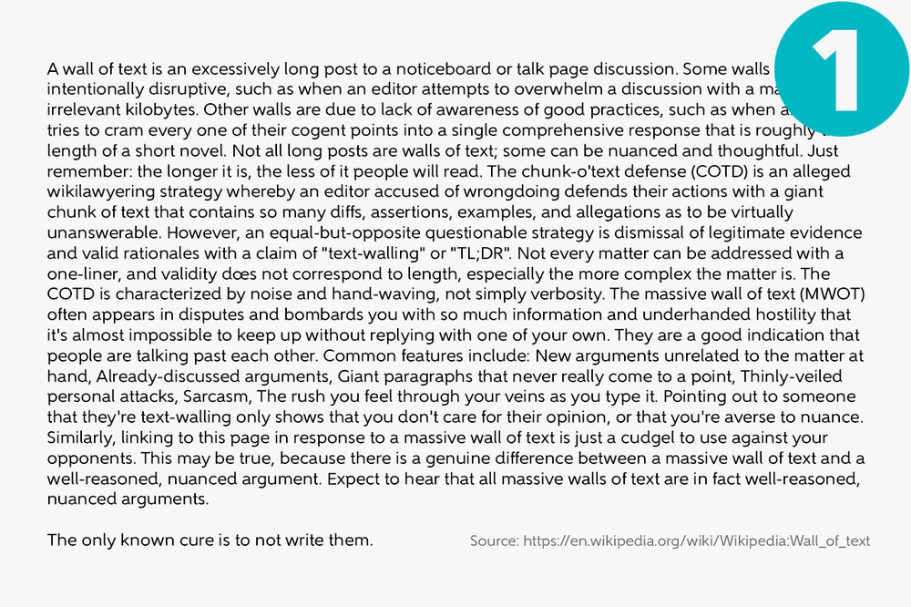
Most about pages I see are basically a “wall of text” which uses the default page template that comes with their theme.

Source: Hananiah Wilson – How To Avoid The Dreaded Wall of Text
A lot of people do this because they don’t know any better. And, even if they WANT to make a better about page, they don’t have the tech skills to do anything beyond what it is built into the theme.
This is why I am strongly advocating something like Thrive Architect. You could do it with Elementor (see my review) or Divi (ugh), too, or perhaps any other page builder. But, in my experience, Thrive Architect is the easiest to use and has features specifically built for a conversion-focused page such as our About Page.
An even better combo would be to use Thrive Theme Builder and the full version of Thrive Architect side by side. It gives you the fine-tuned ability to control not only the global theme (like header and footer), but also take 100% control of everything in between using Architect. You will not be confined by anything. Click here to read my Thrive Theme Builder review.
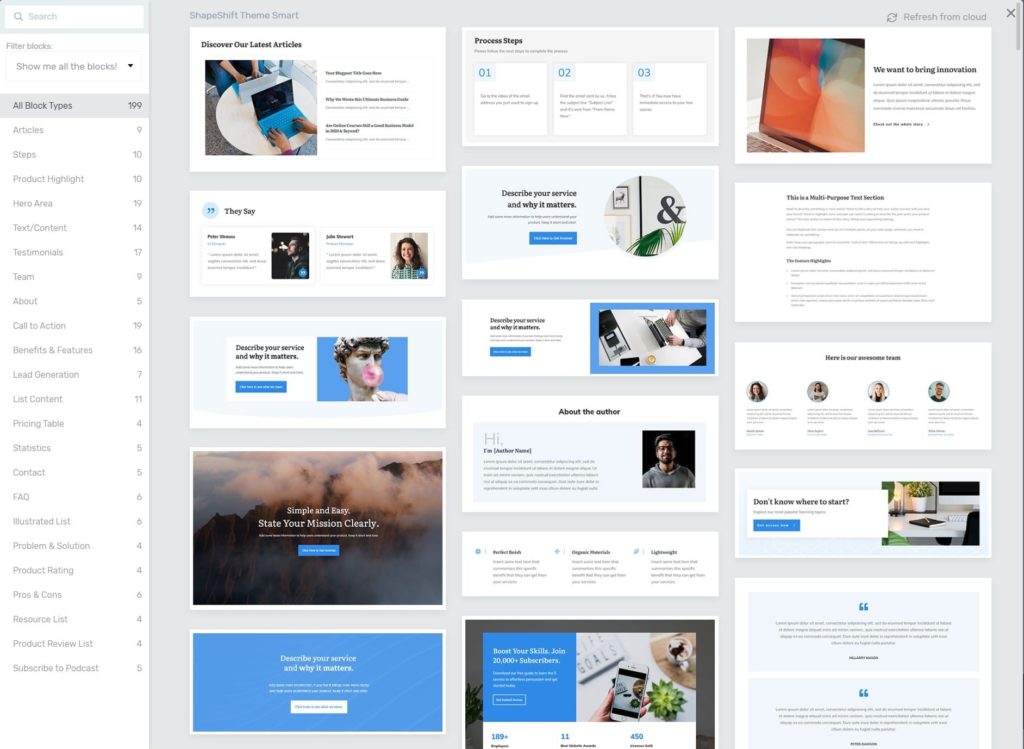
Thrive Themes has a number of pre-designed content blocks that give big-shortcuts to all this:

There are also a ton of nice-looking full-page templates available as landing pages. These can work, too, although they are designed to override your theme completely. You can insert your global header and footer on it to make it look like the rest of your site, but it is still a theme override.
The cleanest option, in my opinion, is to use Thrive Theme Builder + Thrive Architect. This is what I have done with my own about page. My header and footer was fully designed with Theme Builder. It makes it child’s play to then build the page with Thrive Architect and make things look consistent.

Thrive Themes Bonus Training
Look over my shoulder while I show you some of the in’s and out’s of Thrive Themes tools, best practices, and some nifty tricks. You will also have a direct line to me to ask any question you want about Thrive so that I can be an additional line of support for you as you use these tools.
Access to this course is FREE as a bonus if you purchase Thrive Themes via our affiliate link. Click here to learn more.
Getting Great Images For Your About Page
The images that you place on your about page are important. They need to back up your branding and your message.
What many people do is just go through their personal photo archives and find a photo that looks acceptable. We’ve all done it. Me, too. There’s no shame in it. 😉 But, we still want to select an image which makes sense.
What about a simple photo of yourself? Well, it can work. But, does it help your brand message at all? What feelings and ideas do you want your viewer to have and associate?
Look at the image collage I decided to use on the current version of my about page:

These are photos that I randomly selected out of our family collection. I used Abobe Spark to create the collage, but there’s a number of options to do that. But, here’s what I was going for here:
- To show that I am a family guy
- To show that we travel and have a life
In terms of branding, what does my target market want? Well, for the most part, they want to live life on their own terms, have time and location flexibility. They value time with family. Get it?
When you see internet marketing “gurus” post their stupid photos with mansions and Lambos, we sorta giggle at it. But, even that is strategic. Their target market wants that. They’re showing the part (even if it is fake 😉 ).
I haven’t made this happen yet, but if I could customize my own “hero shot” for my homepage or about page, it would be of my RV sitting in some really nice looking campsite. I would be sitting at a picnic table or in a folding chair in front of the RV. I would have my Macbook Pro in my lap and I would be…. “working”. It is visually showing the perfect combination of work lifestyle, location flexibility and lifestyle.
I will create that photo at some point as soon as I’m in the right setting. 🙂
One other last piece of advice…
If you have the opportunity to take photos specifically for this purpose, pay attention to how the photo is framed. I would put you on one side of the photo and have a lot of space off to one side.
This will allow the photo to be more easily used as the background on a row, with you on one side and a headline with CTA on the other.
So, I’ll leave you with this…
Find photos where the brand promise is being SHOWN. Stay away from stock photos. Best option is YOU living out exactly what you talk about on your site. And if you don’t have such an image, you can consider specifically getting one made.
Is your blog’s design as conversion-focused as it could be? I’ve developed the Blog Design Audit to guide you through each of your core pages and design elements of your blog so you can evaluate whether they’re fully optimized for max effectiveness. Click here to grab your copy.
Now, It’s Your Turn
This post was a complete waste of your time unless you now go put it to use. So, here’s what I want you to do…
- Go check out your own about page.
- Identify 3 or 4 things that you can improve about it.
- Then, make it happen.
Don’t worry about making it “perfect”. If you’re anything like me, you’ll be making edits to your about page from time to time for… years. 🙂 My about page has seen so many versions, it’s nuts.
If your about page is just a default page with the word “About” on the top and a wall of text, then I highly encourage you to build a new version using a page builder like Thrive Architect.
As you make changes to your about page, don’t be afraid to model what other people are doing. Trust me, the people you’re modeling probably modeled somebody else, too. Don’t copy anything, but there’s nothing wrong with using another site for motivation and ideas.
Lastly, if you want to take this same level of strategy to all of the pages (and even the layout) of your whole blog, then we have a course on that. It is called the Perfect Blog Blueprint. In that course, we go much further than just the about page of your blog.

By far, the easiest and most economic option to gain access to that course is via our PRO Membership. You can access to not only the Perfect Blog Blueprint…. but every other thing in our library. All at once.
Check out the PRO Membership if you’re interested to take the next step.

David Risley has been building on the web since 1998 and founded Blog Marketing Academy in 2008. After years helping bloggers and online entrepreneurs grow their businesses, he now runs Concierge — a done-for-you WordPress management service for membership sites and online businesses. He manages hosting infrastructure, handles the technical heavy lifting, and keeps client sites running at peak performance. Click to read his full origin story.
Popular Right Now

What If Your Website Was Just… Handled?
I manage WordPress sites for creators and small teams who don’t want to fight tech anymore. Hosting, updates, security, performance — plus a real human you can ask anything.


