The 6 Core Pages Of Your Blog – And How To Tweak Them To 2X Your Conversions
In this post, I’m going to talk to you about how to tweak your blog for conversions. We’ll talk, specifically, about 6 important core pages and how to tweak each of them in order to double your conversions (or more).

Answer this question about your own blog. And, be honest, OK?
Did you set up your blog specifically for conversions? Or did you just slap something up there based on your “gut feeling” of what would work? Or based on what your theme had built into it already?
For most people who are starting out – and even many long-timers – it is the second option.
If that’s you, then your blog is primarily just a big collection of blog posts. The core pages are likely being overlooked. And your main thoughts about conversions come down to stuffing things in your sidebar and hoping somebody clicks on it. This is what I like to call trying to get “impulse clicks”.
It rarely works.
In this post, I’m going to talk to you about how to tweak your blog for conversions. We’ll talk, specifically, about 5 important “core pages” you should have on your blog.
The reason this is important is because conversions are the name of the game here. If you’re not getting your readers to do something valuable when they come to your blog, then you’re building no leverage, no asset, no value. Which adds up to a huge waste of time.
So, let’s get started…
What “Conversion” Are You Shooting For?
The word “conversion” refers typically to getting the person to opt-in or to buy something. However, it could be anything.
Anything that you want your visitor to DO from that page is a conversion. Typically, it is to opt into your list. However, a conversion could be something as simple as clicking a link to the next page, posting a comment, filling out a survey, etc.
YOU determine what a conversion is for each specific page.
Plus, each page you put onto your blog (and each blog post) should have a conversion in mind and be geared to funnel people into that conversion as effectively as possible.
If you’re just throwing stuff up there without trying to get them to do anything, then it is a waste of your time. And not optimizing for anything but instead just throwing a ton of stuff that they COULD click on up there…. well, that’s generally a waste of time as well. It is just impulse clicks with no intention behind them.
Your Blog As An Attention Funnel
Now, in order for your blog to serve that function, it has to be set up to funnel attention.
 See, think of attention as a flow of energy – and honestly, that’s exactly what it is. When a person is sitting on the other end of their computer looking at your blog on their screen, you can almost envision little attention beams coming out of their eyes and looking at your blog. But, that attention must be GUIDED. Otherwise it will flow all randomly and not go anywhere.
Ever poured a glass of water onto a concrete floor? The water just splatters around in a random fashion and makes a huge mess.
But… pour that glass of water into a funnel of some kind and the water doesn’t splatter. In fact, it will be guided rather gently into whatever it is aimed at.
The same thing happens with this energy we call attention. And your blog’s primary function is to attract attention and then funnel it to the next logical step.
Now, in most cases, that first step of attracting attention is going to be by way of one of your blog posts. And, in almost all cases, one of your blog posts will be the main entry point to your site. And there’s a number of things you can do on a blog post to optimize it as an attention funnel, such as:
- Paying attention to what I call “content packaging“
- Including a targeted content upgrade to build your list right from within the post
- Not cluttering up your sidebar with useless garbage that visually distracts
- Including in-post links to places on your site you want them to go
But, aside from your blog posts, you’ve got the “core pages”. Sometimes people will land on these pages directly, but most often people will come to these pages after doing something else. This means they are more “qualified” because that second click means they’re more interested than a casual web surfer who just scans and bounces off.
The 6 Core Pages Of Your Blog
We need to take into account the mindset of the person on these core pages – and set them up accordingly. So, let’s review 6 of the most important core pages of your blog and what to do with them.
#1 – Your Home Page
Of all your core pages, your homepage is most likely to be used as an entry point for your blog. So, with that, let’s look at the typical mindset of the reader on this page…
They know nothing about you yet. They really don’t give a crap about you, to be honest. They have one question on their mind: Is this site relevant to me and should I care?
Now, what most people do with the blog homepage is run it fairly “default”. Most themes will display latest posts by default on the homepage… which means that most blog homepages are crammed full of 5-10 full blog posts, a ton of sidebar widgets and the like.
In other words, most blog homepages are just visual overload and completely overwhelming. And that sucks for conversions.
The homepage of your blog should do these 3 things:
- Clearly communicate your brand and value proposition.
- Move them a little down the belief chain to believing in what you offer.
- Give them a CLEAR next step.
See, the purpose of the homepage is to catch them, sell them on the fact that you’ve got something they’re looking for, and then move them along deeper into your site (ideally by way of subscribing).
One example of this is NerdFitness:
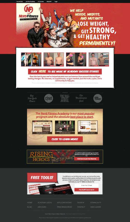
The flow of their homepage is actually quite simple and effective. Let’s take the attention funnel top to bottom:
- The brand and value proposition immediately answers the question of what they do, right their at the top. The branding image really backs up the whole thing, too.
- Immediate social proof of actual case studies with the before/after photos, with a call to action button that goes right to their sales page for the Academy
- More social proof in the form of media logos.
- Another call to action to the Nerd Fitness Academy
- A “ad” for their Rising Heros program, which is a monthly continuity program
- Free Tools, which is an email opt-in. At this point, they’ve scrolled through the things to buy, so the free opt-in is kind of like a downsell.
- Lastly, their navigation menu.
It is like their homepage is a list of priorities. There are multiple conversion in place, but as the visitor scrolls they are met with downsells. And I think it is quite strategic on their part that they don’t put their navigation menu at the top as a central feature. It is at the bottom after they’ve seen everything else.
Nicely done. 🙂
So, here’s what I recommend you pay attention to on your own blog’s homepage:
- Are you effectively communicating what your site’s value proposition is? If you’re unsure, ask a few of your friends their first impressions who are not already readers of your blog.
- Are you including any elements of why your blog is trustworthy? Social proof? Testimonials?
- Are you funneling them into that content which is mostly likely to immediately deliver the best value to them, based on knowing where they’re likely at?
Don’t allow people to scatter from your homepage. Give them an opportunity to connect then move them along in a targeted manner to those things most likely to make an impact. Be strategic about it… not just your latest blog posts (which is based on time, not strategy).
#2 – Your Blog Page
If I’m recommending that your blog’s homepage NOT be a list of your latest posts, then it goes to show that you’re going to need another page to serve that function. That would be your “blog” page. Often, you’ll actually have “Blog” in your navigation menu for it.
Now, on this page, people usually expect to see a chronological list of blog posts. So, go for it. 🙂 The typical mindset of the person on this page is that they’re looking to see what else you have to offer. So, the goal of this page is to allow them to find something of value.
If they find something of value, then they’ll click on it. This moves them a little further down the funnel of potentially becoming a real subscriber. Plus, it reduces your bounce rate and increases page views. Win all around.
So, to maximize the effectiveness of the page, do the following:
- Keep sidebar clutter to a minimum. I’d recommend an opt-in and links to your “most popular” posts (that you hand-picked).
- Have nice, big headlines that pop out and don’t blend in.
- Preview images work nicely to communicate value of each post.
- Don’t use any plug-ins or Wordpress features on the post lists which repeat incessantly for each post. For instance, category links, tag lists, social media buttons, etc. These things can be on the post itself, but repeating it over and over again for every post on the list of latest posts is ridiculous and clutters things up. NOBODY is going to share a post they haven’t read anyway.
- Have an obvious search function (but only if your blog has enough content to avoid them running into dead ends).
As an example, you can look at the Digital Marketer blog is currently doing it:
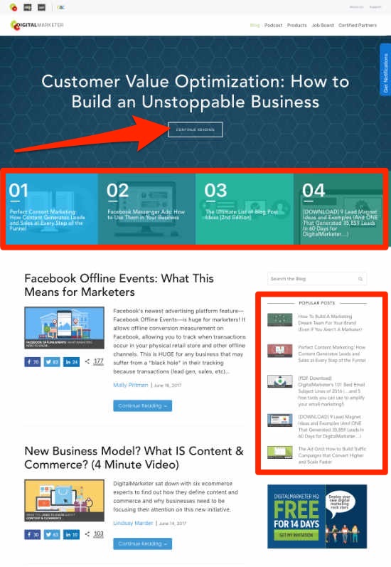
They’ve got the chronological list of latest blog posts, of course. However, the blog page is optimized to funnel people into their hand-picked core articles. What I would call Redwood Posts. Each of their Redwood posts is a major pillar post of their site, each optimized quite well for lead generation. Most of the top real estate of their blog page is all hand-picked for conversion purposes and the chronological lists of latest posts is beneath it.
Digital Marketer is using the Ultimate Conversion theme found on ThemeForest, but you don’t have to totally switch themes to do something similar. If you use Thrive Content Builder, you can assemble a page for your blog which is optimized as you want – and do it right on top of your existing theme.
Then, you just assign your blog index page to be the new page that you’ve created. Go to Settings > Reading, then choose the page that you want to be your blog index page:

#3 – About Page
Every blog should have an about page because people will indeed visit it when trying to figure out what you’re all about. The typical mindset of the person on this page is… “Should I care?” So, what’s your answer to that?
The about page won’t usually be an entry point to your site, but it is a page they’ll go to after arriving from another page. And their sole purpose is to find out why they should care about your blog.
What most people do on their about pages is drone on about their life story or other drivel. And while you might not think your story is drivel, THEY DO. Why? Because they don’t know you yet.
So, your about page isn’t literally a page about you. It is about your site and WHY THEY SHOULD CARE. In other words, the about page is a sales page about you and your blog. It should “sell” them on your site and (like all good sales pages) give them a call to action. Namely, the option to subscribe.
I go into much more detail on this on this post about how to create a killer about page for your blog.
#4 – Getting Started
 Many people don’t have “getting started” pages, yet they’re an insanely good idea. Especially if your blog is catering to people who are trying to accomplish something big which has a lot of parts to it.
See, your blog could be chocked full of awesome content. But, without a clear structure and some order, it can still be confusing. The Lab is the same way. We’ve got an entire course library in there, yet being thrust into it as a new member can generate a lot of confusion about what to do next. So, I’ve got The Roadmap which gives a very clear starting point and order of progression through it.
What you’re doing is answering “What now?” and “Where should I get started?”
You should have a solid understanding of the transformation that you’re in the business of delivering (See episode #42 of Coffee Break Blogging: What is a Transformation Map? And Why Is It So Important To Your Profitability?) But, all transformations have a beginning, a logical sequence, then an ending.
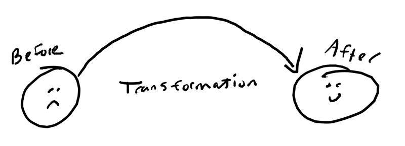
Your Start page meets them right at the beginning of the transformation. At the “Before” state. That’s likely where they’re at now.
And all the page does is orients them and tells them where to begin.
Typical things done on a “getting started” page include:
- Orient them to the main purpose of the site and the outcome you’re shooting for.
- Tell them exactly what their first steps are.
- Invite them to connect to take it further. (aka, opt-in). Optimally via a lead magnet which is expressly designed for somebody just getting started.
On this page, you want it to help them get started with your site, but you also want it to help them get started on the transformation itself. You want them to get a “win” from it. To feel like they just accomplished something – and associate you and your brand with that “win”.
To get an idea of one way to do this, you can check out my own getting started page. Additionally, you can see how BecomingMinimalist.com did it. Short story of how the brand got started, links to their best stuff, and invitation to connect. Very… minimalist. 😉 But, effective.
#5 – Contact Page
A contact page is pretty much standard on all blogs. So, it is most definitely a core page.
What most people do is simply throw a contact form on there and call it a day. But, like all core pages, it can also be optimized to enhance your business.
I’ve got a whole blog post on this topic right here: How To Create A ‘Contact Us’ Page That Invites Conversions And Generates Sales
#6 – “Thank You” page
Much of what we’re doing on the blog is about moving them down the funnel – namely to opt-in for a lead magnet and get onto the email list.
Now, obviously, when somebody submits that opt-in form, they’re going to come to a “thank you” page. And that’s a VALUABLE page. After all, they just took a pretty significant action: They gave you their email address.
One of the 6 principles of persuasion from Robert Cialdini’s Influence: The Psychology of Persuasion is consistency. Essentially, people are much more likely to follow through on something that they’ve already started. Getting them started can be the hardest part, but once they’ve done it, it is easier to move them onward. So, a person takes step #1 and opts into your email list. If you’re not giving them an opportunity to take another step, then you’re dropping the ball.
Now, if you’re building out a proper blog profit funnel according to the monetization model, then the “thank you” page will contain an offer to purchase a relevant front-end offer. So, it’d be something like…
“Hey, thanks for subscribing! Everything I promised is being sent to your email inbox in just a few minutes, but while you wait, let me show you how _________”.
Then you educate them, and provide them an opportunity to buy something from you. Something cheap (because you haven’t yet built up enough trust for anything else) that they could buy with minimum risk, minimum funds, but get crazy value from you. That puts a buyer on your email list. It also shows them that you deliver good value.
Here’s what one of my “thank you” pages looks like. It is actually an offer for the Business Building Bootcamp at a discounted rate to people who opt in for a particular lead magnet:
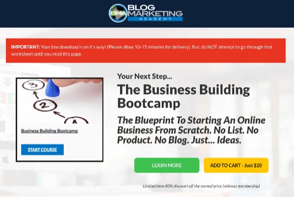
Now, if you don’t have a good front-end offer yet (you should make one), there are other things you can do with this “thank you” page. Such as:
- Fill out a survey (which could gather useful information for you).
- Invite them to connect with you on social media.
- Invite them onto a forthcoming webinar.
- Invite them to share the fact they just subscribed on social media (use a pre-formatted tweet and include a hashtag). This can provide a little viral promotion of your opt-in and it doesn’t cost you anything.
Point is – don’t just say “Thanks! Check your email to confirm”. That’s boring and a waste of a valuable page.
Always have them take another action.
Put This Into Action
First of all, if you found this post useful, I’d appreciate it if you could hit one (or more) of those share buttons to share it with your social network. 🙂 Thanks. 🙂
But, aside from that, you’ve got to begin putting this into action.
For many, the technical part of actually optimizing these core pages is the real barrier. Most themes just don’t have these pages tweaked well. Unless you know how to hack your theme, it can be frustrating to make things look right.
The Thrive Content Builder is definitely the solution I recommend. It will totally enable you to tweak your pages as you see fit… without any knowledge of HTML, CSS or PHP coding. Plus, you can tweak these pages all without having to switch your whole theme. I’m a huge fan of the whole Thrive suite of tools, and you can read my review of Thrive Themes here.
We also have a course on all of this (and much more) inside The Lab. It is called the Perfect Blog Blueprint. In that course, we go much more in-depth on how to optimize and tweak each element of your blog.

David Risley has been building on the web since 1998 and founded Blog Marketing Academy in 2008. After years helping bloggers and online entrepreneurs grow their businesses, he now runs Concierge — a done-for-you WordPress management service for membership sites and online businesses. He manages hosting infrastructure, handles the technical heavy lifting, and keeps client sites running at peak performance. Click to read his full origin story.
Popular Right Now

What If Your Website Was Just… Handled?
I manage WordPress sites for creators and small teams who don’t want to fight tech anymore. Hosting, updates, security, performance — plus a real human you can ask anything.


