SEO Optimization: The Ultimate Guide To Search Engine Optimization For Bloggers
An ultimate SEO guide for bloggers and content creators. How relevant is keyword research? What are the factors Google looks at? How exactly do we go about attracting organic traffic from the world’s most popular search engine? This guide covers it all.

If you’re serious about getting traffic to your site and growing your business through content marketing, then you most definitely need to be versed in the basics of search engine optimization for bloggers.
Why?
The internet has matured. Google has matured. The amount of data they have at their disposal has shot through the roof. Add some machine learning and artificial intelligence (AI) into the mix, and Google has gotten pretty smart. And the changes to how Google does things has a direct impact on your ability to get organic traffic from Google search.
In this mega-guide, I’m going to give you the overview of everything you need to know to optimize your blog for search. We’re going to cover many different ranking factors and I’m going to link to a lot of resources and tools.
I don’t necessarily expect you to read the whole guide beginning to end. 🙂 You can use it as a reference when needed. And I’ll provide a table of contents to help you get around.
OK, let’s do this…
Search Engine Optimization Has Changed
The old tactics like purposely trying to go out and link build, worrying about keyword density in your blog posts, keyword stuffing, worrying about dofollow links, guest posting. All of that is dead. You can blame marketers for that. They and the SEO firms killed it by institutionalizing “gaming the system”.
Search engines grew up. They evolved. They’re wise to the stupid things marketers have been doing to rank their stuff.
Plus, Google is always trying to create a better user experience. When the search results serve the needs of the searcher, that person will continue to use Google. That’s what Google wants. Google wants to surface the best stuff that fits what the person is looking for. And, if you’re trying to game the system to get there, you are Google’s enemy.
So today, standard SEO is dead. It has limited workability. And spending all your time (or paying some SEO firm) to sit there and build backlinks for you laced with keywords… it is a waste of your time and money.
Do keywords still matter? Sure they do, but you can’t game the system. It has to be natural.
Do backlinks still matter? You bet they do. But, the backlinking efforts of most SEO companies out there leave an unnatural link pattern that Google can see from a mile away. Having a bunch of low quality backlinks with the same handful of keyword phrases in your links…. that’s unnatural. Regular people just don’t DO that! But, NATURAL backlinks from real quality sites, that will ALWAYS help you with your SEO.
Today, SEO is different. And to see how it is different, it helps to see how Google has evolved.
Google Has Gotten Pretty Smart
Google has a simple mission:
To deliver to the end user exactly what the user is looking for.
At the essence, it has been based around keywords within the content. A user types words into the search box and Google would go out and find content with those words.
In the beginning, it was pretty elementary. The results weren’t very good because a computer couldn’t interpret the meaning of the words being entered. All it could do was direct matching. Google would look to various external ranking factors as signs of that content being good.
Backlinks became one of the chief external ranking factors. The number of links to the content as well as the keywords being used in those links gave Google a pretty decent idea of what the content was about. And, the number of links was related to how “good” it was.
Problem is, marketers learned to game the system. They’d stuff keywords into the content. They’d go out and engineer backlinks. They’d even hire companies just to spam the internet with backlinks in an effort to make their stuff rank higher in Google.
Google didn’t like this. And it developed newer and smarter algorithms that go by animal-themed names such as Hummingbird, Penguin, and Panda. Most of their algorithm changes are incremental updates, but every now and then they released a big one that really impacted how things work.
Most recently, they’ve created Rankbrain. This brings the world of machine learning into search.

All of these changes have gotten quite good at surfacing the best stuff as well as the most relevant stuff to the end user. Even when the searcher uses keywords that are “plain English” and a computer might not know what is intended, Google has now gotten pretty good at it. RankBrain has a lot do with it.
Yesterday, It Was Keywords. Today, It Is Engagement And User Satisfaction.
Across the board, signs of quality for content are found in various signals of user engagement and satisfaction. Is the user actually ENGAGING and interacting with the content?
With Facebook, the site is constantly trying to surface the things YOU most engage with into your newsfeed. While it used to be via their EdgeRank algorithm, they have evolved into a more developed machine learning algorithm that takes more than 100,000 factors into account to decide what goes into your newsfeed.
In the world of email marketing, it is the same thing. You need your subscribers to engage with your emails otherwise your deliverability will drop and you may end up in the spam folder. You want your subscribers to open your emails, click on them, scroll through them, REPLY to them. Essentially, all the things that you would do with an email from somebody you know, like and trust. (Read this article on email deliverability for more on that).
And then we come to our blogs. Our blog posts. We see the exact same story. Engagement is the real key.
Google is sitting there looking at a variety of different signals for user happiness with the search results. And it is reacting to them in real-time. If it looks as if result A is satisfying users more than result B, then result A will outrank B in the search results. This is where machine learning comes in because Google adapts on the fly.
But, how does Google know when a user is happy with the result?
Well, they look at various user behaviors that are indicative of their satisfaction. Things like:
- The click-through rate from the Google results to the page
- How long the user stays on that page
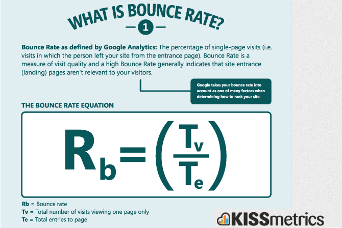
- The bounce rate
- Whether the user is pogo-sticking through the results (visits #1, quickly backs out, visits #2, quickly bounces back out, etc.)
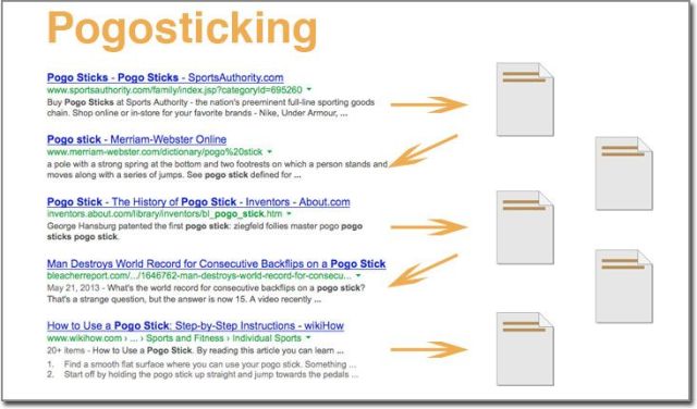
(Image credit: Pogo Sticking – Hurting Your SEO & Rankings)
All of this adds up to a very large shift in search engine optimization. It isn’t brand spankin’ new, by any means. But, if you’re still stuck exclusively in the arena of long tail keyword phrases and backlinks, you’ll miss the boat.
Whereas SEO has classically been about keywords and links and other mechanical things, today it is all about optimizing for HUMANS.
The New SEO Is UXO (aka User Experience Optimization)
UXO = User Experience Optimization.
Your best SEO is actually going to be done by way of optimizing the user experience. Catering to real, flesh and blood human beings. Not bots.
Do visitors click on your content? Do they read it? Do they engage with it? Do they find it useful?
People do not engage with articles spewed out of an article spinner. They do not engage with low quality content that just makes them hit the back button. They do not engage with keyword-stuffed articles that clearly don’t really help. They’ll be on that article just long enough to determine that it sucks. In the face of this kind of thing, all the keyword optimization in the world simply won’t matter.
Is Keyword Research Still Relevant?
Yes, of course it is. Keywords are still the fundamental determiner of what the content is about and it will always be that way.
However, one need not get as nitty-gritty about keywords as perhaps they used to.
See, with “old school SEO”, the name of the game became all about long-tail keywords. Every SEO person was always talking about long tail keywords. These are multi-word phrases that get much more fine-tuned or even perhaps just different ways of saying the same thing. So, people would look at the search volume on all these long tail keyword phrases and try to work then into their content.
It does work and, to a degree, always will. For instance, Neil Patel wrote a post about how long-tail search was used to get his blog up to 20,000 monthly visitors.
But, as Google is getting smart – and especially as it has implemented machine learning with RankBrain – the high focus on long tail keywords is dwindling. They’re getting smart enough to know when one search phrase means essentially the exact same thing.
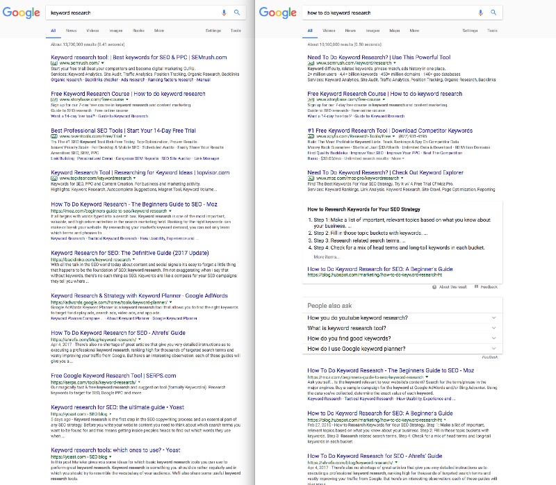
The image above might be a little tough to read, but it is a two sets of search results. One for “keyword research” and the other one for “how to do keyword research”. The “how to” one is a long-tail version of the same keyword phrase. In the part, these two searches would be optimized for separately as two distinct things. Now, while the results are not identical, you’ll notice that both results are almost identical and that the same sites appear on page 1.
Google is now smart enough to better understand user intent. For this reason, it no longer makes as much sense to create a ton of different pages targeting specific long tail keywords. Other things are taken into consideration.
This isn’t to say the long tail is read. I mean, one can also see that the “how to” phrase shows a nice rich snippet (great if you can optimize for that) as well as the “people also ask” section. That “people also ask” section shows the effort that Google is using to provide relevant answers to plain-English questions people enter into Google.
As Brian Dean puts it, you want to aim for “medium tail keywords”. As he puts it:
Medium Tail Keywords are middle-of-the-pack terms. They get more search volume than your average long tail. But they’re not insanely competitive, either.
Google is smart enough to fill in the gaps for a lot of the long tail keywords below you. RankBrain will automatically rank you for a bunch of similar keyword phrases without you having to specifically do it. Ahrefs did a study on this. As they put it:
It looks like the average #1 ranking page will also rank in the top 10 for nearly 1,000 other relevant keywords.
So, your best bet is to optimize your page around a single, strong medium tail keyword. Let RankBrain do the rest to rank you for the other, smaller ones.
But, of course, you don’t rank for such a keyword by just stuffing it in there and repeating it a bunch of times. Your content has to truly be amazing. As Corbett Barr put it, you have to write epic shit. But, how exactly does Google determine if your article is epic?
By looking at signals of user engagement…
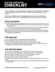
Get The Most Out Of Your Next Blog Post! Use The Blog Post Preparation Checklist
- Ensure your post will appear perfectly on social media sites, and help enable free viral traffic
- Maximize your revenue potential for the post so it acts as a true, long-term asset
- Optimize your post for SEO and get free, organic traffic
- Ensure high engagement with your post, keeping them on your site longer and reducing bounce rate
7 Signals Google Uses To Determine Engagement
Google has a simple mission: To provide the best user experience to people who use Google.
To do that, they want to present the best, highest quality content at the top of the search results. In the past, it was all about keyword relevancy. Today, it is about much more than that.
How does Google tell if people are diggin’ a piece of content? Well, there’s a lot of data they can use as signals, such as:
- Click-through rate
- Scroll depth
- Time on page & Bounce Rate
- Social shares of the article
- Natural backlinks
- Readability
- Site Speed
Let’s go into more detail on each of these engagement signals…
#1 – Click-Through Rate
If you go run a search on Google.com, hover over any link in the search results. You’ll notice that it doesn’t point right to the website.
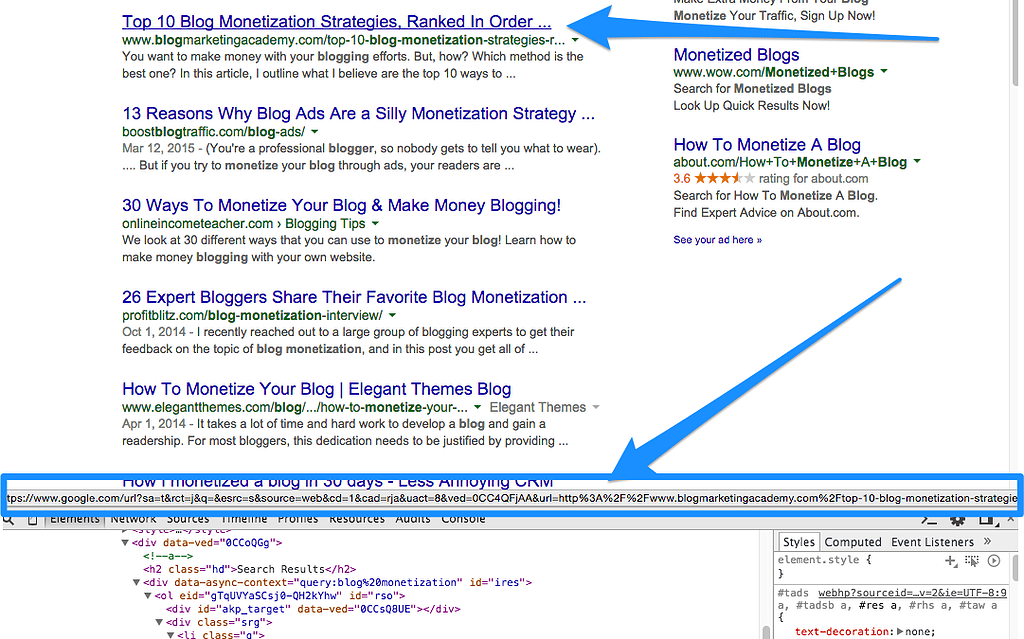
They’re actually running all outgoing traffic through their own tracker. They’re keeping tabs on what people are clicking on.
If the title and the description seen in the SERPs makes people want to click on it, then you’ll get a higher CTR from the Google search results. Hence, a higher CTR.
So, we want to optimize our listing for the click-through just as we would optimize an email subject line or anything else.
First, you definitely want to optimize the blog post headline. Not only on the post itself, but in how that headline looks on Google. This post talks a ton about how to optimize your headlines, but here’s a few quickies…
- Put some emotion into your headline to make it more interesting.
- Juicy / Crazy / Awesome / Fabulous / Seductive / Powerful / Attention-Grabbing / Insane / Outrageous / Disturbing / Sleek / Mind-blowing / Seriously / Delicious / Successful / Valuable / Useful / Shocking / Alarming / Terrible / Fascinating / Brilliant
- Put promise words into the headline.
- Effective / That will / Study / Case study / Examples / Proven / New
- Put brackets or parentheses at the end. Hubspot did a study that showed that headlines with brackets which clarify the contents got 38% more clicks than those which didn’t. This very blog post you’re reading right now is an example (not the headline).
- Use Numbers. And we’re not just talking about list posts. Specific numbers get more attention because the results are more realistic.
You also want to optimize your description. It works as a sub-headline, essentially, and also serves to convince the person to click on your article from the results. The same kind of ideas apply. Make it emotional and sell them on WHY they should click on your result. It’d also be a good idea to insert a few proven keywords into the description. You can include related keywords as well as your main target keyword.
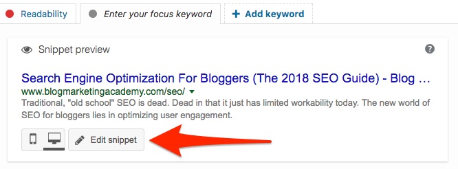
Now, how do you take control over this? Using the Yoast SEO plugin is one way to do it. I now personally use the RankMath plugin. Both Yoast and RankMath allows you to preview what your page will look like in Google. If you hit the “Edit Snippet” button, you can take control over the headline and the description as it will appear in the search results.
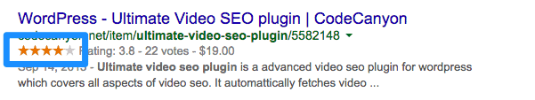
You can use a plug-in like KK Star Ratings to set up star ratings for your posts. They’ll look like this on Google:
It pays to think of your Google listing in SERPs just as you would the headline on a landing page or an email subject line. Tweak it to SELL them on clicking on YOUR result over the others. Because that click-through rate is a solid signal to Google that people prefer your content. And they’ll reward you for it with higher rankings.
#2 – Scroll Depth And How To Optimize It
Scroll depth is simply a measure of how far down the page people scroll. Think about it… we tend to scroll down on pages which get us interested. Right?
You can use tools such as CrazyEgg to see how far people are scrolling down your page.

You can also use the Scroll Depth add-on for Google Analytics to be able to track it inside of your analytics account. The WP Scroll Depth plugin for Wordpress will make it a lot easier to integrate this type of tracking on your blog.
Now, how to you increase the chances that people scroll down your page further?
Well, a lot of it comes down to your content. This is why it is harder to game the system than it used to be. Those posts which are most likely to invite good scroll depth also happen to the the longer-form, most valuable posts which make people WANT to do that.
Some content tactics would include:
- Infographics. People will usually scroll to see the whole image.
- Images. Especially images that cut off right at the page fold, thereby enticing people to scroll to see the whole thing.
- Teasers at the top of the post. Hint at what’s below so as to entice people to go down. Check out the anatomy of the perfect blog post.
- Huge Resource Posts. These are longer posts, usually with a lot of images and videos in them. These invite scrolling since they’re so freakin’ USEFUL and people love them. Practice what I call the Redwood Strategy.
- Don’t hide the content. Don’t have a big preview graphic that pushes your content below the fold. You want what they came for – the content – to be right there in front of them.
- Use a good hook. The hook is the first few lines of the post. Use that key text to sell the content they’re about to read. Make them WANT to scroll down and read it.
- Break up the content into chunks. Nothing is harder to read than a big block of text. Break it up using sub-headlines.
- Use compelling sub-headlines. The same rules you would apply to a primary headline to entice the click should be used on every sub-headline to entice further reading.
One little interface tactic you can employ is a simple little arrow that simply points downward. Here’s an example from the Apple Mac Pro website:
That arrow just says “Yes, scroll down because there’s more”. And you do.
One way to automate putting this onto your Wordpress site is by using the Smooth Page Up/Down Buttons plugin.
#3 – Increasing Time On Page And Reducing Bounce Rate
The longer people stay on your page, the more engaged they are. Also, if they click onto other places rather than immediately bounce off, that’s also a sign of quality.
Google can tell. For one, most of us are using Google Analytics, so we shouldn’t be surprised if they use all that information to know what’s going on with our sites. Not only that, I showed above how they’re tracking clicks off the SERPs. If a person clicks though to your blog and then they return back to Google within a few seconds, then Google sees that. And that’s a sign that your content just didn’t resonate.
We ALL do that! We’re looking for something on Google. We click on something and check out the page. If it doesn’t rock our world within the first few seconds, we hit the back button and go back to Google to look at the rest of the results. Right? It is called pogo sticking.
Google SEES that. And you’ll see it in your site metrics reflected by low time on page and a high bounce rate.
Well, it just so happens that many of the “tactics” that work to increase scroll depth also work to increase time on page and reduce bounce rate. Things like:
- Infographics. People will hang around to study it.
- Huge Resource Posts. These are longer posts, usually with a lot of images and videos in them. People will hang on these pages longer.
- Including videos in your posts. They stay on your site while they watch the video, therefore increasing time on page.
Sit back and look at those 3 points. What kind of content usually has those qualities? HELPFUL, VALUABLE content.
See, it is getting harder to game the system. This is the new world of SEO.
Also, for more information on reducing your site’s bounce rate, see:
- Coffee Break Blogging, Episode 56. How To Reduce Your Blog’s Bounce Rate.
- Simple (Yet Powerful) Tip For Reducing Your Site’s Bounce Rate
#4 – Getting More Shares
Clearly, when a post has a lot of social media shares, that’s a direct signal of great content. People don’t generally share content they think sucks.
So, one of the factors of modern blog SEO is optimizing to get more social shares.
First, it goes without saying yet again (although I’ll do it anyway 😉 ), but the most surefire way to get more social shares is to create epic content that inspires people to share it. You can clearly see a consistent theme here. The days of lackluster, lazy content are over. It’ll never rank.
But, there are also more specific ways that you can help increase your social shares.
- Use tweetables. This is simply a highlighted quote from the article which is suitable for a tweet. Next to it is a button that invites a retweet of that quote. That tweet obviously includes a link back to the post.
- Creating an infographic to go along with the post. Very popular for sharing on Pinterest.
- Using Thrive Comments for your comments (if you have comments) which then allows you to present a call to action to all commenters. You could ask them to share it.
- Present a content upgrade where they share the post to unlock access.
- Run a paid ad to amplify the post on social media.
#5 – Getting More Natural Backlinks
You do not want to engage in any paid links, link exchanges or anything at all which would give you unnatural back links.
In fact, I am generally a fan of simply doing everything else in this article and letting backlinks take care of themselves. I figure if I do my job well, people will want to link to me if it makes sense.
If you want to go the extra mile, however, there are some strategies you could employ to help the link building process along in a natural way:
- 12 Secrets To Building Natural Backlinks
- Natural Link Building 101
- The Single Lazy Method For Building Natural Backlinks: It Works!
#6 – Ensuring Readability
Yes, it matters. And proper grammar and spelling is a sign of quality that Google uses. They know that people won’t engage with content that isn’t very readable.
This doesn’t mean you have to be a grammar nut. It doesn’t mean you need to mind-numb yourself trying to remember all those stupid rules from English class. Don’t ever let those arbitrary rules get in the way of effectively communicating to real people.
But, there IS a point where typos and grammar issues get in the way of effective communication. And, when it happens too much in one post, we know that the writer just half-assed it.
This is also why the old days of using article spinners are over and dead. DO NOT use article spinning software. Everything about it is just… wrong. Everything.
You can use a tool like Grammarly to help check for grammar. Make sure you do a spell check. Another simple strategy is to simply read your post to yourself out loud. Does it sound natural? Can it be read without sounding ridiculous or choppy? Keep in mind the increase in voice search like “OK Google!” and you can see why this matters.
Another helpful tool is, again, built right into the Yoast SEO plugin. In addition to optimizing for a target keyword, there’s a tab there for readability.
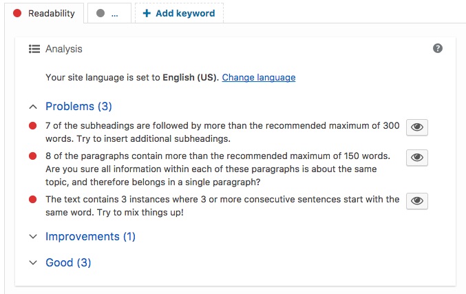
It’ll give you areas it identifies as readability problems and areas for improvement.
#7 – Increasing The Speed Of Your Blog
You’ve probably heard that the speed of your blog and the server it is on has an impact on SEO. It does. The speed of your site is part of the user experience.
A slow server response time is going to increase your bounce rate and reduce time on page. People just don’t have the patience to sit there and wait for your site to load.
You can use a service like Pingdom to test your site. You can go right to the big kahuna and have Google test it with PageSpeed Insights, too.
Some things you can do to increase the speed of your blog are:
- Use a solid web host. I generally recommend Siteground to most of my new bloggers (here’s why), but there’s a reason I prefer (and personally use) Cloudways. Cloudways gives you a lot more power and flexibility than most of the hosts usually discussed. You can see my review of Cloudways here.
- Content Delivery Network. If your web host doesn’t have CDN built in, then you can use a third-party like MaxCDN. (Watch: What is a Content Delivery Network?) I used to use MaxCDN myself until I switched to WPEngine and didn’t need them anymore.
- Clean up your code. Many of the themes and page builders people use these days brings a lot of extra code to your pages. That means more bloat. It is important to use performance optimization plugins like WP Rocket that can work wonders to optimize your code by stripping out stuff that isn’t needed. You can also use PerfMatters to selectively disable things on different sections of the site in order to make a more streamlined code footprint.
- Reduce the number of plugins. Every plug-in you add to WordPress adds bulk. Plus, most plug-ins pull in extra resources that load up site-wide. First step is to simply de-activate and remove any plug-in you don’t really need. Secondly, consider adding plug-in profiles to your blog to control where and when plugins are enabled or not.
- Optimize Your Images. Images add a lot of bulk to the downloadable size of your site, and many images contain extra “payload” that doesn’t impact how well they appear on your site. Removing that payload will reduce file size. I personally use ShortPixel for image optimization. Imagify is also a good choice.
Other Important Google Ranking Factors
As covered above, modern SEO is very much about optimizing for humans. It is about optimizing the user experience. And we’ve covered many of the more important factors that Google uses to make that judgement.
But, there is more. And these are things you most definitely want to bear in mind in order to optimize your site for search.
#1 – Ensure Your Site Is Mobile Friendly
In November 2016, Google announced mobile-first indexing. This means that your site working properly on mobile is now a direct influence on whether you will rank in search or not. It is absolutely paramount that your site design is mobile responsive.
Most modern themes are designed to be mobile responsive right away, although you always want to test it to make sure. Google provides a test to see if you’re mobile-friendly.
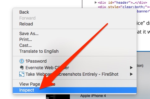
You can also test it right in your desktop web browser if you like. For instance, both Chrome and Firefox have a tool called Inspector built-in. Simply right-click anywhere on your site and choose “Inspect” or “Inspect Element”.
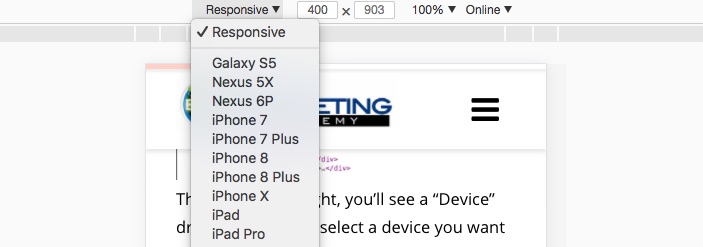
You’ll then see a little phone/tablet icon in the Inspector.
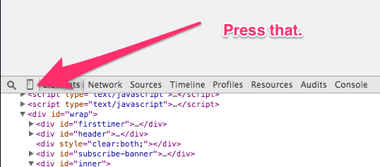
You’ll then get a mobile version of your site. You can even select different devices to see what it would look like.
Another thing to keep in mind is that this isn’t only about your site theme. Even if your theme was designed to be mobile responsive, you might have done things to your site that harmed it. Perhaps theme modifications or the addition of plug-ins. So, it is important to test it.
Also, Google wants a good mobile experience. This means getting rid of any popups, full screen takeovers or anything that makes it difficult to use on mobile. Being “mobile responsive” isn’t just a checkbox you can check off. You have to actually USE the site that way and ensure it is user friendly.
If you run any slide-in opt-in forms for list building (or popups, splash screens, etc.), make sure you exempt mobile devices. I personally you (and recommend) Thrive Leads and it makes it easy.
#2 – Schema Code
Schema markup code is HTML code that goes on your site that provides context to your site. It helps Google understand what your content means and provides context which can often be helpful to return the best search results.
Schema code can also be used to take advantage of some of the highlighted featured of Google search results, such as rich snippets or the information box. For example, if you search for a local business, you’re likely to get the information box to the side.
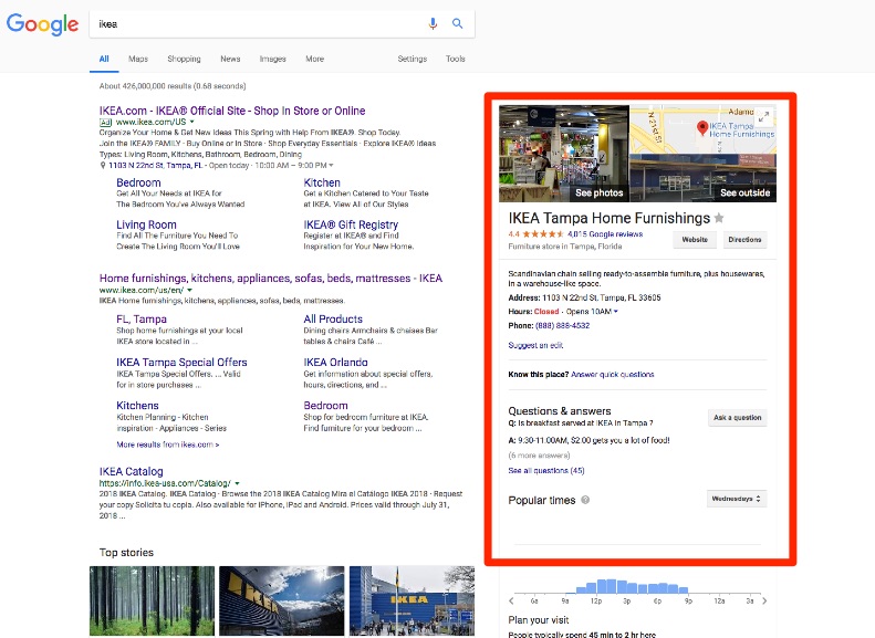
When I run a simple search for Ikea, I get not just a list of articles with the word “ikea” in it. First, it knows where I am and gives me my local store. You also get the information box where it pulls out the address, description, phone number, hours and much more. This is all powered by schema code because the data has context that Google can use.
Getting into implementing this can be a little nerdy, to be honest. However, there are some tools that can help.
Google has the Structured Data Markup Helper to help generate the markup code. It allows you to visually tag your page.
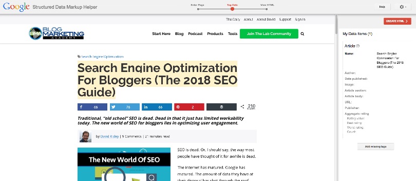
Now, while this helps generate the markup code, it would then be up to you to manually insert that code into the HTML of that page. Quite frankly, that’s annoying. The good news is that there are also plug-ins which can help make the process faster.
While I am a huge fan of Yoast SEO, it doesn’t do much for schema code. It takes care of some of the basics like basic company info, social profiles, etc. But, there is another plug-in simply called Schema (also available in the Wordpress plug-in repository here) that goes much more in-depth. You can run both plug-ins at the same time and this article highlights the differences between the two. There is also another plug-in called All In One Schema Rich Snippets which might be worth checking out.
The following articles go more in-depth into the use of schema code:
#3 – Brand Recognition
We’ve already discussed how social shares can have a big impact on your SEO. Not only does that include the obvious networks like Facebook, Twitter, Pinterest, etc… but it also includes other social sites like Reddit and Quora. Your activity across all of these sites ultimately leads to more backlinks and more traffic.
But, the more traffic your site gets from these major authority brands, the more your site will be recognized by Google.
This creates a snowball effect. More traffic, more brand recognition, more domain authority. This, in turn, helps with your Google listings. Which, in turn, helps once again to increase the very things that help those listings.
So, it definitely helps the effort the more engaged YOU are in the overall internet. Being “out there” and active helps to get your brand out there.
You can also help your brand authority by by using paid traffic. Distributing your content out there with ads boosts the brand.
#4 – Domain Power
Domain matters. Now, this doesn’t mean you buy a keyword-stuffed domain for your site. But, exact-match domains do still help with SEO. Also, the age of your domain is a ranking factor. If your domain has a long track record, it will be easier to rank than if your domain was just registered and your site is new.
Ahrefs did a study on how long it takes to rank in Google. They found that the average age of a page listed in the top 10 results on Google were more than 2 years old. Only 22% of the pages in the top 10 were less than a year old. And, interestingly, their study showed that only 5.7% of all newly published pages will get to Google Top 10 within a year.
So, longevity matters. You have to have some staying power. It takes some dedication.
This is another good argument for the Redwood Strategy, too. 😉
#5 – Secure Site Using SSL
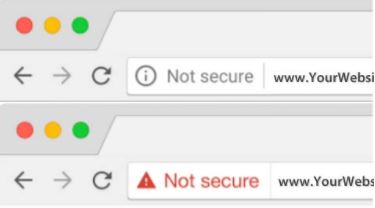
Since August 2014, SSL is now a ranking factor for Google. Simply put, it now helps to have your entire blog secured using HTTPS.
And Google is pretty serious about it. In late 2017, they even warned webmasters that the Chrome browser will overly label non-HTTPS sites as “not secure”. It will do this on any site that has any input fields on it. That means any form, even a run-of-the-mill opt-in form.
The solution is simple: secure your site.
Many web hosts have reacted to this by simply providing free SSL using their SSL certificate. If that’s the case, you should be able to secure your site with nothing more than a click. If you are conducting business, I recommend you have your own SSL certificate tied to your own domain name. Most hosts will set up a free SSL certificate for you using FreeSSL.
Once SSL has been set up on your host, you will likely need to make a few adjustments to your Wordpress site so it works correctly. Luckily, there are plugins like Really Simple SSL and Wordpress SSL that can help with the nerdy stuff.
#6 – Google E-A-T and YMYL
Google is now injecting themselves into the decision-making process on whether your content is WORTHY of being displayed to the end user. One could look at this in a good way or a bad way, depending on your viewpoint. And part of the problem with this is that it introduces an element of judgement into things and it isn’t exactly clear how Google determines this.
Since August 2018, one concept that has rung loudly is E-A-T. It stands for Expertise, Authority and Trust. The other one is YMYL – “Your money or your life”. These two things together have led to the August 2018 Google update being called “the medic update”. Here’s why…
Let’s say somebody searches for a medical issue they are experiencing. If a site comes up because they were good at traditional SEO, it doesn’t necessarily mean that the advice they were giving was true. When it comes to content which can affect the user’s happiness, health or wealth, Google isn’t just about finding relevant information. They want to find CORRECT information. In other words, if it affects the reader’s money or their life, Google is putting itself into the position of judging whether that post is worthy and true.
This isn’t simply an algorithm thing. Google employs several thousand people to act as search quality evaluators. They run search spot checks. They check sites that are coming up. And they make human judgement calls on whether a site is trustworthy, authoritative, or run by an expert.
So, what do we do about it?
For establishing expertise, consider:
- Meet and exceed expectations of what your audience is looking for. Answer their questions definitely, but go beyond just the simple.
- Make your content well developed. Hit multiple mediums. Reach beyond the surface level stuff everybody says.
- Update content, correct errors
For establishing authority, consider:
- Seek links from authority sites relevant to your market.
- Having mentions in media can help.
- Have a developed bio and author box on your site that shows why you should be listened to.
- Put the work into developing a real brand that is seen in other locations around the internet.
For establishing trust, consider:
- Having an contact methods
- Having an address or office address for your site
- Having terms of service, privacy policy and other legal pages in your footer
- Having HTTPS set up for your domain (already discussed)
The motto here is to think like a human being and give people what we all know they are looking for – expertise, authority and trust. Not every element of SEO is about the algorithm.
#7 – Voice-Friendly Content
More and more, people are searching the web using voice. Using either their smartphone or a smart device in their home, they simply ask what they want from Google. But, get this…
This also means that they are not seeing the typical SERPs. Google is basically pre-digesting the results and delivering the answer in a curated form from the primary result. In this scenario, only ONE search result matters. The rest of them might as well not even exist.
This is serious, given that about 71% of searchers prefer using voice (“Hey Google!” 😉 )
The solution to this is that you want YOUR result to be the featured snippet for a given Google search. About 40% of all voice search results come from the featured snippet, according to BackLinko. So, how can you get into the featured snippet spot?
- Optimize for long-tail keywords. Using the “People also ask” section can lead to a bunch of ideas in this regard. This will show you what people ask – and how they ask it. You can then tweak your title tag to match the question you want to optimize for. Keep in mind, your title tag does not have to match your post headline. An SEO plug-in can help you take control.
- Put the question/phrase you are optimizing for into your first article header (aka sub-headline).
- Answer the question succinctly and briefly. The average featured snippet is 40-60 words, so aim for that.
- You can optimize for several questions at a time by repeating this across your post. In other words, an FAQ posted as a blog post.
#8 – Core Web Vitals
Google has recently taken some of their focus on mobile experience and other page experience factors and assigned actual numbers to them.
These scores are called core web vitals.

At this time, there are 3 core vitals. They are:
- Largest Contentful Paint (LCP). LCP measures how long it takes for the largest content element (e.g. a hero image or heading text) on your page to become visible within your visitors’ viewport. This is a direct measure of site and server speed.
- First Input Delay (FID). This is the number of milliseconds between when a user clicks the link to your page and when the page will be loaded and responsive to new user input.
- Cumulative Layout Shift (CLS). This measures visual stability. In other words, does the site shift and move after it is loaded up enough to make it hard to use.
These core web vitals each have numbers. And there’s a range you want those numbers to be in. They are:
- LCP should less than 2.5 seconds.
- FID should be less than 100 milliseconds.
- CLSs should be less than 0.1.
If you’re in the green, you’re good. Anything greater than that doesn’t necessarily mean you’re going to suddenly disappear from Google. That said, they’re making no secret of the fact that these numbers will have an SEO impact, so it is good to pay attention.
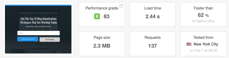
There are some tools you can use to score your pages and get advice on how to improve the numbers. The ones most popular are:
- Pagespeed Insights. Direct from Google. For that reason, a lot of people treat it as gospel, but it really isn’t.
- Think With Google. I don’t care for this much as it isn’t super useful, but does provide a more realistic idea of your site load time on mobile devices.
- GTMetrix. I really like this tool. The only problem is that it is a desktop-only test so doesn’t help much in improving your mobile scores.
- Pingdom. Doesn’t provide quite as much info as some of the others, but some of the summary info it provides is helpful.
- WebPageTest. This one has a nice interface and does a good job of honing in on what can be addressed.
It is important to not take any one tester as gospel. Each tool has it’s own strengths and weaknesses. You will notice that they say much of the same stuff (which makes sense), but sometimes the WAY it is presented to you provides a better idea what to focus your time on.
Also important is to run several tests. Every time you run a test on a page of your site, you’re likely to get different numbers. Run at least 3 tests and take an average. That said, the actual score is NOT the most important thing. It is just an indicator. More important is the info on what you can do about it.
It is pretty typical to get mobile scores on Pagespeed Insights that seem really low. This is because it uses an algorithm to simulate your page on a really slow 3G connection.
The thing to keep in mind is that these tools are indicators. None of them are built for newbies and they’re not going to just tell you exactly what to do in plain English. You use them as indicators and they will help point you in the right direction as to what to focus on and what changes to make to the site.
Get The Most Out Of Your Next Blog Post! Use The Blog Post Preparation Checklist
- Ensure your post will appear perfectly on social media sites, and help enable free viral traffic
- Maximize your revenue potential for the post so it acts as a true, long-term asset
- Optimize your post for SEO and get free, organic traffic
- Ensure high engagement with your post, keeping them on your site longer and reducing bounce rate
Final Thoughts
This article is an absolute beast, at least in terms of blog content. I really hope you found it useful. 🙂
Search engine optimization is one of those things that takes time and consistent work. Most of that work goes into creating truly epic content. You can’t be lazy and rank well in today’s Google.
But, I think one of the most important things to keep in mind here is not to get overly concerned about what Google wants. This isn’t about satisfying a Google search bot. You want to know what Google is looking at, but what you REALLY need to be doing is optimizing for humans.
Today’s search engine optimization is actually about optimizing for human beings.
You’ve got to know your market. Know your avatar. Know what they’re looking for and what impresses the hell out of them. Then, make it for them. All while making the content digestible, useful and shareable. Basically, blow their freakin’ mind!
Can you hit a homerun every time you post? Not likely. Plus, as we mentioned, ranking in Google isn’t a quick thing.
So, this is a marathon. Not a race.
If you need to slow down your blogging to focus on quality instead of quantity, then do it. Execute the Redwood Strategy. Create content with longevity instead of giving your subscribers quick hits. You can even do what I do and use the Redwood Strategy on the blog and take your more frequent stuff to the email list.
Many bloggers see SEO as a mystery. Google scares them. And they try to keep up so they can appease the Google gods. 😉
But, it is much simpler than that. Just create awesome stuff and give the right signals to Google that you’re doing it.
Google isn’t your enemy. But, they are there to serve the end user. Which is exactly what you should be doing.
Popular Right Now
What If Your Website Was Just… Handled?
I manage WordPress sites for creators and small teams who don’t want to fight tech anymore. Hosting, updates, security, performance — plus a real human you can ask anything.
Tools, checklists, and resources for solopreneurs who want to spend less time on tech — and more time growing. With more tools coming regularly. 😎

